
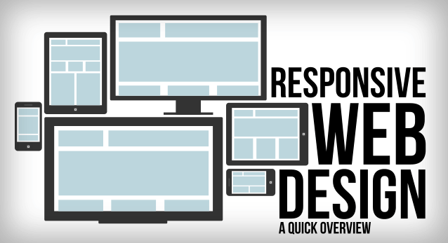
Responsive Web Design: Concept Of Responsive Web Design
Almost every new client these days wants a mobile version of their website. It’s practically essential after all: one design for the BlackBerry, another for the iPhone, the iPad, netbook, Kindle — and all screen resolutions must be compatible, too. In the next five years, we’ll likely need to design for a number of additional inventions. When will the madness stop? It won’t, of course.
In the field of Web design and development, we’re quickly getting to the point of being unable to keep up with the endless new resolutions and devices. For many websites, creating a website version for each resolution and new device would be impossible, or at least impractical. Should we just suffer the consequences of losing visitors from one device, for the benefit of gaining visitors from another? Or is there another option?
Responsive Web design is the approach that suggests that design and development should respond to the user’s behavior and environment based on screen size, platform and orientation. The practice consists of a mix of flexible grids and layouts, images and an intelligent use of CSS media queries. As the user switches from their laptop to iPad, the website should automatically switch to accommodate for resolution, image size and scripting abilities. In other words, the website should have the technology to automatically respond to the user’s preferences. This would eliminate the need for a different design and development phase for each new gadget on the market.
The Concept Of Responsive Web Design
Transplant this discipline onto Web design, and we have a similar yet whole new idea. Why should we create a custom Web design for each group of users; after all, architects don’t design a building for each group size and type that passes through it? Like responsive architecture, Web design should automatically adjust. It shouldn’t require countless custom-made solutions for each new category of users.
Obviously, we can’t use motion sensors and robotics to accomplish this the way a building would. Responsive Web design requires a more abstract way of thinking. However, some ideas are already being practiced: fluid layouts, media queries and scripts that can reformat Web pages and mark-up effortlessly (or automatically).
But responsive Web design is not only about adjustable screen resolutions and automatically resizable images, but rather about a whole new way of thinking about design. Let’s talk about all of these features, plus additional ideas in the making.
Adjusting Screen Resolution
With more devices come varying screen resolutions, definitions and orientations. New devices with new screen sizes are being developed every day, and each of these devices may be able to handle variations in size, functionality and even color. Some are in landscape, others in portrait, still others even completely square. As we know from the rising popularity of the iPhone, iPad and advanced smartphones, many new devices are able to switch from portrait to landscape at the user’s whim. How is one to design for these situations?
In addition to designing for both landscape and portrait (and enabling those orientations to possibly switch in an instant upon page load), we must consider the hundreds of different screen sizes. Yes, it is possible to group them into major categories, design for each of them, and make each design as flexible as necessary. But that can be overwhelming, and who knows what the usage figures will be in five years? Besides, many users do not maximize their browsers, which itself leaves far too much room for variety among screen sizes.
Since then even more devices have come out. It’s obvious that we can’t keep creating custom solutions for each one. So, how do we deal with the situation?
Everything is Flexible
A few years ago, when flexible layouts were almost a “luxury” for websites, the only things that were flexible in a design were the layout columns (structural elements) and the text. Images could easily break layouts, and even flexible structural elements broke a layout’s form when pushed enough. Flexible designs weren’t really that flexible; they could give or take a few hundred pixels, but they often couldn’t adjust from a large computer screen to a netbook.
Now we can make things more flexible. Images can be automatically adjusted, and we have workarounds so that layouts never break (although they may become squished and illegible in the process). While it’s not a complete fix, the solution gives us far more options. It’s perfect for devices that switch from portrait orientation to landscape in an instant or for when users switch from a large computer screen to an iPad.
The way forward
Fluid grids, flexible images, and media queries are the three technical ingredients for responsive web design, but it also requires a different way of thinking. Rather than quarantining our content into disparate, device-specific experiences, we can use media queries to progressively enhance our work within different viewing contexts. That’s not to say there isn’t a business case for separate sites geared toward specific devices; for example, if the user goals for your mobile site are more limited in scope than its desktop equivalent, then serving different content to each might be the best approach.
But that kind of design thinking doesn’t need to be our default. Now more than ever, we’re designing work meant to be viewed along a gradient of different experiences. Responsive web design offers us a way forward, finally allowing us to “design for the ebb and flow of things.”
Posted by Ingenium Web

iNGENIUM Ltd. is an software development company from EU which delivers a full range of custom .NET, web and mobile solutions for different business to meet partner's demand.
The Power of Imagination Makes Us Infinite
Related Posts

Today's internet era is more about having a mobile-friendly website that is easy to access and control.

The number of mobile users has been growing continuously.

Need a good reach? Go mobile. Want to improve your brand’s visibility? Get onto the mobile. Want to enhance your user base? Create a mobile app.
When mobile internet usage surpassed that from desktop devices, it didn’t come as a blow to those who were paying attention.


Comments
comments powered by Disqus