
Responsive Web Design: The Fluid Grids
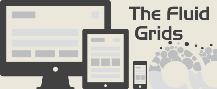
Part of any good web design in these modern times is the fluid grids. Our canvas, the browser window, can bend and flex to any shape or size, whether changed at the whim of the reader, or fixed by the phone or tablet they’re using to view our content. This practice will accommodate a variety of browsers already that demand the design be flexible and fluid.
The huge problem regarding the web design that we have today is that computer monitors and laptop screens grow each day wider, and on other hand we have different dimensions on mobile devices. More than ever, we need a design unique approach that caters to our growing range of screen widths.
The Role of Fluid Grids
The fluid grids of responsive web design are one part of this approach.
The simplest grid is made up of one, two, and three columns. Typically they have content that fits within a single horizontal row. More complex grids (having upwards of 9, 12, or more columns) also start to bring in higher row counts to control content. In complex grids, the vertical columns act more as registration points for laying out a row’s content.
And while grids on the Web follow print grids in displaying with fixed widths, they also have the luxury of becoming fluid. Fluid grids have columns and gutters (the space between columns, where the widths are relative to their containers). The containers themselves can be either fixed width or relative, but the columns must be a proportion of their container to earn the fluid label..
The RWD fluid grid does best is provide a way to stop worrying about the grid, particularly in terms of how content on the page is laid out. Rather than setting the layout of your site in fixed-pixel widths, fluid grids use their proportional sizing to adapt to a user’s device.
How do you create a fluid grid?
Let's start by defining two nested elements. First element is parent div element with id page, and second one is nested div element with class attribute blog.
#page
{
    width: 960px;
    margin: 0 auto;
    font-size: 12px;
}
.blog
{
    margin: 0 auto 53px;
    width: 900px;
}
We created two elements in our markup, and gave them a fxed width in our CSS. But when we’re thinking flexibly, we need to translate our design into something more fluidly, something more proportional. So let's begin with learning some of basic rules of fluid design.
But to move toward a more flexible grid, let’s start with a percentage value to replace that 960px:
#page
{
    width: 90%;
    margin: 0 auto;
    font-size: 12px;
}
By setting our #page element to a percentage of the browser window, we’ve created a container that will expand and contract as the viewport does. And as that container is centered horizontally within the page, we’ll be left with a comfortable five percent margin on either side.4
Instead of a value set in pixels, we need to express .blog’s width of 900px in proportional terms:
A formula to remember
In Dan Cederholm's excellent book, Handcrafted CSS, Mr. Ethan Marcotte contributed a chapter covering fluid grids. In it, he provided a simple and consistent formula for converting fixed width pixels into proportional percentages:
target ÷ context = result
Take a look a css of our blog element. All the values are currently set using pixels. Let's work from the outermost element and change them to proportional percentages using the target ÷ context = result formula.
We already know our target pixel width for our blog: that’s 900px. What we want is to describe that width in relative terms, as a percentage of .blog’s containing element. Since .blog is nested within the #page element, we’ve got our context—namely, 960 pixels, the width of #page as it was designed in the mockup.
So let’s divide our target width for .blog (900) by its context (960):
900 ÷ 960 = 0.9375
But by moving the decimal over two places we’re left with 93.75%, a percentage we can drop directly into our CSS:
.blog
{
    margin: 0 auto 53px;
    width: 93.75%; /* 900px / 960px */
}
Using ems instead of pixels for typography
The size of an em is in relation to the size of its context. If we set a font size of 100 percent to our tag and style all further typography using ems, they will all be affected by that initial declaration. The upshot of this being that if, having completed all the necessary typesetting, a client asks for all our fonts to be a little bigger we can merely change the body font size and all other typography changes in proportion.
Using our same target ÷ context = result formula, I'm going to convert every pixel based font size to ems. It's worth knowing that all modern desktop browsers use 16 px as the default font size (unless explicitly stated otherwise). Therefore, from the outset, applying any of the following rules to the #page tag will provide the same result:
12 ÷ 16 = 0.75
So the #page element is 0.75 times the default body size, or 0.75em, which we can plug directly into our stylesheet.
#page
{
	width: 90%;
	margin: 0 auto;
	font-size: 0.75em;        /* 12px / 16px = 0.75em */
}
Off-the-shelf Grid Solutions
Off-the-shelf solutions take the goal of trouble-free structure to new heights. All you need to do is find a solution you’re comfortable with, sit back, and relax. Some grid solutions that we recommend using are:
- 960 Grids
- Bootstrap
- Gridset
- 320 and Up
960 Grid System
Nathan Smith’s 960 Grid System, started life as unashamedly desktop-focused—perfect if you’re looking for a desktop solution. For a mobile-first approach, Smith has more recently put in the hard yards to move the framework there too. To satisfy both approaches, 960 Grid System provides a raft of tools that include CSS and JavaScript files for rapid prototyping and publishing, as well as templates for many popular design environments such as Balsamiq, Fireworks, Omnigraffle, and Photoshop.16 There are currently fifteen in total that ease the flow between design, development, and publishing.
Bootstrap
Boostrap is a sleek, intuitive, and powerful front-end framework for faster and easier web development. It epitomizes the drive behind responsive web design to enable developers to quickly release applications that hold the user’s needs at the forefront.
Gridset
Gridset has the rapid prototyping and design focus that you expect from a class-leading framework. It provides you with easy-to-use tools so that you can put away your calculator when managing columns.
Gridset is not about simply adding breakpoints to your CSS; it’s about designing in the browser while looking outside it for inspiration.
320 and Up
320 and Up was the first high-profile responsive web design solution that addressed Mobile First design. Mobile First works from the basis that the common elements on both mobile and desktop versions of an application all exist on the mobile version. You design for the mobile device first, and then use progressive enhancement to augment the experience of the application on larger viewports.23 You don’t have to just focus on the framework’s 320px base; it also provides breakpoints via media queries at 480px, 600px, 768px, 992px, and 1382px.
In this post, we've learned how to change a rigid pixel-based structure to a flexible percentage-based one. We've also learned how to use ems, rather than pixels for more flexible typesetting. Finally, we've experimented with a responsive CSS Grid system that allows us to rapidly prototype responsive structures with very minimal effort.
Resources
Responsive Web Design by Ethan Marcotte
Jump Start Responsive Web Design by Craig Sharkie & Andrew Fisher
Responsive Web Design by Ethan Marcotte
Responsive Web Design with HTML5 and CSS3 by Ben Frain
Posted by Ingenium Web

iNGENIUM Ltd. is an software development company from EU which delivers a full range of custom .NET, web and mobile solutions for different business to meet partner's demand.
The Power of Imagination Makes Us Infinite
Related Posts

Today's internet era is more about having a mobile-friendly website that is easy to access and control.

The number of mobile users has been growing continuously.

Need a good reach? Go mobile. Want to improve your brand’s visibility? Get onto the mobile. Want to enhance your user base? Create a mobile app.

When mobile internet usage surpassed that from desktop devices, it didn’t come as a blow to those who were paying attention.


Comments
comments powered by Disqus