
Mobile Website Design: How to Make Your Website Mobile-Friendly?

When mobile internet usage surpassed that from desktop devices, it didn’t come as a blow to those who were paying attention.
Mobile users worldwide were increasing at a rapid rate. This proliferation of mobile devices has changed the way we interact, engage, shop, purchase, and search.
For website owners and startups building a mobile website, this means optimizing your website for smaller screens. Several user experience components might work seamlessly on a desktop device, but not quite fit well with a mobile device’s tiny screen. This is how we arrived at a concept called responsive web design.
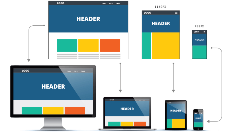
What is a Responsive Website Design?
A responsive website design displays the same content and information as it does on any device, but changes the way these components are shown. Making a website design responsive is critical for many reasons.
- Google recently identified website responsiveness as a key factor in search engine ranking and rolled out the Mobile Page Speed Update.
- Nearly 60% of Google searches now happen on a mobile device, which is another alluring factor to redesign your website for mobile.
- Nearly 80% of internet users now own a smartphone and spend 69 percent of media time on smartphones.
It is clear that having a mobile-friendly website design helps get higher SEO traction and increases conversion and engagement through mobile devices.
Let’s explore how a website can be made more mobile-friendly in a few simple steps.
Focus on Simplicity
Simple website designs appear more responsive than their complex counterparts. Large and heavy components will become slow on a mobile device, hampering the customer experience. A simple yet responsive website design can help you keep your site visitors focused on the content you want them to see.
The mobile attention span is rapidly shrinking, and you don’t want this to affect your site’s credibility or conversion rates. Therefore, keeping the design simple can be better than making it complicated and hard to navigate.
Optimize Image Sizes
Responsive website designs have small image sizes, along with high image quality and clarity. Smaller image sizes make sense for mobile devices as the bandwidth of mobile devices is lesser when compared to desktop, which often causes slow-loading.
Therefore, forcing users to download a 1 MB image file on your website can introduce a lag in the website loading time, frustrating the visitor, and spoiling the overall experience.
Use Standard Fonts
Often, marketers and website designers like to use creative custom fonts to enhance the look and appeal of a website. While that works on a desktop screen, it can prove to be an issue with a mobile screen.
For better responsiveness, ensure your site’s fonts are easier to read and comprehend without straining the visitor’s eyes. Responsive websites contain text that is optimized for readability on the smaller screen without the need for zooming.
Simplify Site Menus
Mobile screens are significantly smaller than desktops. Bear this in mind when redesigning your website for mobile-friendliness. If the menu on your site has a lot of options, it can appear complicated and hard-to-read on a mobile device.
You don’t want visitors to zoom or scroll to view the entire menu on their smartphones. Optimize the user experience for them by restructuring your menu to appear fit on one screen. You might need to look at your menu options and re-classify them for mobile optimization.
Evaluate Forms and Re-design Them
It might help you to think about all the forms you have on your website. As they are, they might get challenging to fill in on a mobile device. If you are asking each website visitor a lot of input, that might not be the best strategy for mobile.
A responsive site has simplistic forms that make it seamless for users to fill them in. A long and complicated signup form can turn away mobile users. If you want to reduce the bounce rate of your forms, trim them down to only capture the necessary information from visitors.
On a mobile device, the placement of all components deserves some thought. 94% of people said that a responsive mobile website design instills trust. Analyze everything clickable, viewable, and defines the site’s navigability. Eliminate pop-ups, and do away with sidebars, unless they are extremely seamless and functional.
If you are not optimizing your site for mobile users, you might not lose customers, but the practice can definitely hamper your growth and conversions. Realize that people are using a thumb to navigate your site on mobile. This ‘rule of thumb’ will keep your website in shape!
Posted by Terrie S. Wheeler

Related Posts

A business website plays a critical role in how customers discover, evaluate, and interact with a brand.

In today’s digital age, a school’s website is often the first point of contact for prospective parents, staff, and the wider community.

In today’s digital world, businesses face a tough choice: tailored solutions or ready-made templates?

Lost your iPhone? Well, it can be a pretty scary experience, but we promise you that not all hope is lost.
In the world of JavaScript programming, asynchronous operations are a fundamental concept that every developer should grasp. Asynchronous programming allows your code to perform time-consuming tasks, such as making HTTP requests or reading files, without blocking the execution of the rest of your...

WordPress is the backbone of over 40% of websites on the internet, making it the most popular content management system (CMS) globally.


Comments
comments powered by Disqus