
Why Your Website Needs To Be Responsive
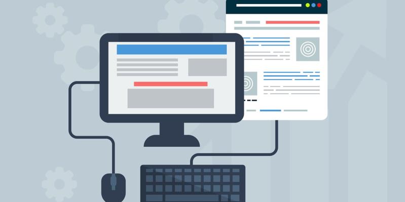
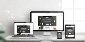
A responsive website is one that can adapt to whatever device is used to look at it, whether that’s a laptop or desktop, or a mobile device such as a smartphone or tablet.
Having a responsive website is good for your business in many different ways, and will ensure that your customers and those who click onto your site are able to use it, buy from it, and even enjoy their experience.
When you start to look at different websites, you will notice that, despite its importance, some sites are not responsive, and are designed only to work on standard computing devices. If yours is one of these websites, here are some of the biggest reasons to change your site so that it is responsive and anyone can use it at any time, on any device.
Google is by far the biggest search engine around with a market share of 86 percent, and it is the one that the majority of people use all the time. Therefore, it makes sense to do what Google suggests when it comes to your website if you want to be ranked higher and, as a consequence, get more clicks and ideally more sales.
Google certainly recommends that you have a responsive website that can be viewed easily on all devices. In fact, when it comes to search engine rankings, Google will favor any site that is responsive over those that are not mobile friendly.
Great User Experience
Offering your customers the best user experience possible is vital if you want to make sales and stand out from the crowd when it comes to being noticed in your sector. Even if you sell something that is similar to a competitor, if you can offer your customers a better user experience on your website, you are the business that will get the sale, and you will also gain repeat sales through word of mouth and happy buyers.
If you can help your customers to buy from you, then you will gain many more sales. They might, for example, start browsing on their smartphones on the commute to work, having just remembered something that they need, or maybe even seen an ad for something that they want. If your site is responsive, they can start looking in this way, continue in the office on a desktop, and make their final purchase on their tablet once they get home if that’s what they want to do. Give them all the options and their user experience is sure to be a good one.
Easy To Manage
If you have one website that is responsive and can change to meet your visitors’ demands, it will be much easier to manage than having two sites: one for computers and one for mobile devices. If you have two, you necessarily also need to have two different marketing strategies, for example, which not only become difficult to deal with but will also cost you more. Managing just one site is always going to be easier, especially when there are so many other things that need to be dealt with in your business. Reducing the amount of work you need to do and the amount of money that has to be spent while also increasing the enjoyment and happiness of your users makes a lot of sense.
Blogging
Your blog is an important tool for your business. It will help your website to rank higher in Google because it will have regularly changing content, and it can be easy to manage if you outsource it to a third party as you can see on this website. Your blog is what will also help many visitors find your site in the first place, and it will enable them to discover how you work and how much you know, giving you the ideal opportunity to show your expertise. Not only that, but your blog is the perfect basis for building an advertising campaign or social media strategy around.
The more people who read your blog, the better it is for you and your business, which is why having a responsive website is a good idea. Your blog will be read by many more people because simply put, more people will have access to it through a variety of different devices. This will help you to get noticed more easily and increase your profits.
Lower Your Bounce Rate
When it comes to your website’s statistics, the bounce rate is all about how long people spend on your site. The longer they stay, the better, because Google will spot that your website has value, plus you will be more likely to make a sale. If your website is not responsive and someone clicks onto it from their mobile device, they won’t stay for very long. They might decide to wait until they are in front of a laptop, or they might choose to find a more user-friendly site altogether. Either way, this will not be good for your bounce rate and will give Google the message that your site is not interesting or informative, thus reducing its reach.
Speed
When you have a responsive website that is optimized for mobile devices, you will find that your site loads a lot more quickly on those devices. It means that people aren’t going to become frustrated because the site is taking too long to load. It means they will stay with your site rather than searching for another that loads more quickly. If you don’t have a responsive website and people have to wait for the desktop version to loan on their smartphones or tablets, it can take far too long. Everyone is busy, and your website needs to save them time wherever possible.
Tracking
A responsive website will give you more idea of who is using your site. You will be able to see how they accessed it, and whether they used a mobile device or not. This can be extremely useful information because you can then create a marketing campaign that speaks to the majority of people who use your site, and how they use it.
Posted by Ingenium Web

iNGENIUM Ltd. is an software development company from EU which delivers a full range of custom .NET, web and mobile solutions for different business to meet partner's demand.
The Power of Imagination Makes Us Infinite
Related Posts


Today's internet era is more about having a mobile-friendly website that is easy to access and control.

The number of mobile users has been growing continuously.

Need a good reach? Go mobile. Want to improve your brand’s visibility? Get onto the mobile. Want to enhance your user base? Create a mobile app.
When mobile internet usage surpassed that from desktop devices, it didn’t come as a blow to those who were paying attention.


Comments
comments powered by Disqus