
How to Design a Mobile Device App that People Would Really Use
Development, testing, debugging and marketing an app won’t yield you any desirable results unless you have an appealing design for your mobile device app and when you are designing something for the smaller screens with such lesser attention span, your UI design should be so efficient that it must work at the speed of the thought.
Today, we will discuss about some of the ways for you to get the things right so that your interface would appeal both the novice and experienced users alike.
Never Forget the Rule of Interactive Design
Smaller screen space surely does not imply that you would let go with the rules of an interactive design. So, let’s first review the 5 pillars of interactive designing before we move further to the creating usable app interfaces.
- Goal Driver: Tailor the work flow and look of your app according to the users who are really going to use your app. Get to know what are the preferences of your users are and design with a final vision.
- Usability: Your app would not be desirable until it is usable for the user. He should be able to use it with ease and enjoy the experience, only then will he keep the app downloaded.
- Signifiers: Use the universal hints in your UI so that the user does not have to think about his next step. For instance, buttoned text would mean that it is clickable and would take the user at some other location in the app.
- Learnability: Keep your patterns familiar and easily derivable for the user to recognize. The app should be designed in a way that the user should learn some new functionality but it should be easily discoverable.
- Response Time and Feedback: The user should know what his actions has resulted in – whether their task has been completed or not. It could be just a phone beep or a push message on their phone but ensure that your feedback is friendly and should be sent out within the standard timing guidelines.
Know Your Users Properly
The biggest constraint that you can face is not the screen size but the user interface expectations. So, the first thing that you need to do is understand your users. Trust us! It will save you from a lot of stress while you are designing and developing the product down the lane. There are 3 methods through which you can know the preferences of your target users.
- User Scenarios: Scenarios would give you a better insight about how a user would react at the different stages while using an app.
- Personas: Personas are basically fictional characters that depict the behavior of your target user. They would let you know about the reactions of the user within the app.
- Experience Maps: You get to explore all the possible reactions that a user can have in every condition and circumstances while using the app.
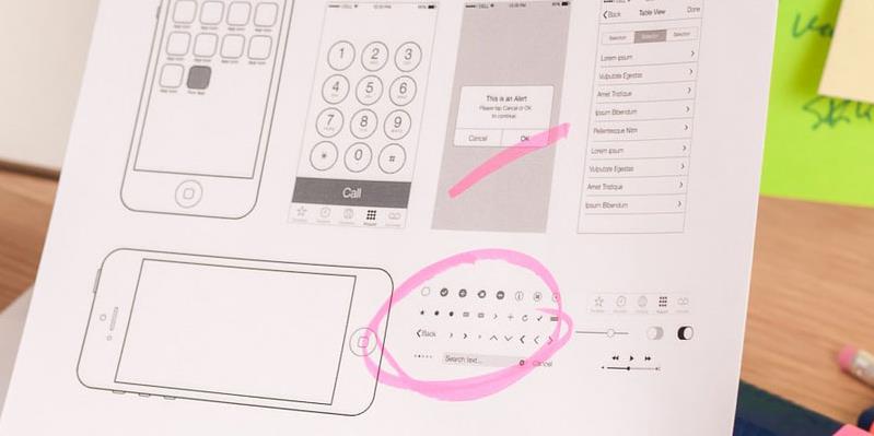
Map the User Flow and Content
Remember that the research and designing work will always move simultaneously. Make sure that you are sketching the user flow on the basis of your research at each step. It does not necessarily have to be something really fancy, you can just create a rough outline on the paper for the reference so that you are clear about what should be the outcome of your design.
In fact, before even starting with the sketching part, create a written outline because that would sort out the most important aspect of your app – the content. Once you will have the content laid down, you can make a better judgment about how many pages you would be required to design to accommodate the content.
Do Not Miss Out on the Accessibility Feature
While you are designing for a laptop or PC, a cursor would do the selection process but on a phone (especially touch) the navigation will be done by the human fingers. So, make sure that your design is compatible for fattest fingers also. Allow enough space for the users on the clickable objects in your app to tap it with ease.
If the user would have to tap a single tab multiple times or zoom in the page in order to make his selections workable, it will become really frustrating for him which would ultimately result in a bad user experience. Also, consider the number of ways that a user will hold his phone or tab while you design the touch targets for the app.
Cut Out All the Clutter
Though the 3-click rule has been ruled out from the UX design, it is worth considering while you are designing a mobile app. When a user is on the app, he expects the task to be completed as quickly as possible. In fact, some of the industry experts suggest to follow the two-tap rule. If a user has to tap on the screen more than twice to perform a single task, then it is time for you to reconsider your design.
Think whether you really need a particular screen to be there in the app or can its content be accommodated along with another screen. Remember! Lesser the amount of time user will have to think while performing a task, more you will be able to achieve your purpose with the mobile app.
Final Thoughts…
You have to understand that even though you would have designed the website with the same domain, the designing for mobile app would require you to research again. The same user thinks and behaves differently while using a website and a mobile app and in order to create an app that would be a success among the target users, you will have to study and understand that difference.
Designing an app is not a simple task. It is as much a challenging task as coding and rectifying the errors. It requires as much understanding of the industry trends and users’ psychology as the marketing of the same app. So, it is recommended that you get your app designed by somebody who is expert in the field or have some previous experience.
Posted by Ashish Sharma
Related Posts

Lost your iPhone? Well, it can be a pretty scary experience, but we promise you that not all hope is lost.

Creating a successful mobile app is a journey, not a sprint. From initial concept to launch, designing a modern and effective app is a multi-layered process that typically demands a significant investment of time, often spanning several months or even a year for complex projects.


If you own a business, you know how important it is to remain at the forefront of your customer’s awareness. If you aren’t visible to your customers, you can’t succeed at retaining their business. Likewise, if it is too difficult to work with your company, many customers will go elsewhere.

Mobile apps can be an effective way to help your business thrive this year amidst the growing competition. It can reach your customers fast and create meaningful connections.


Comments
comments powered by Disqus