
Top 10 CSS Frameworks & JS for Perfect Responsive Conversion

This post will assist all web designers and developers who are craving to discover advanced resources and elements, along with the setting out concepts. It will help you explore the different types of frameworks and their significance in the world of web design.
In the technological era, demand for responsive websites is increasing among the web users. Today, the majority of people are visiting the websites through their mobiles and tablets. Thus, it becomes necessary to design a website for the mobile and tablet platforms.
With the support of most powerful web designing frameworks, you can build responsive websites within minutes. But before reviewing top 10 responsive CCS frameworks and Java Scripts you need to learn more about the frameworks.
Meaning of Framework
A framework is a regulated set of practices, concepts, and criteria for tackling different types of problems. It is used to encounter and resolve the new problems occur during the designing of a website.
In other words, a framework is like a package consisting folders and files of patterned code that includes HTML, Java Script, CSS etc. that are used during the development of a site.
Usually, most of the websites possess a similar structure, and the frameworks help in providing the prevalent structure with an objective to save the time of the website developers. In fact, you don’t need to revise the thing, as you can reuse the same code again.
Let’s highlight some of the best frameworks, used during the development of responsive websites. Each one of the framework is unique and supportive, as it offers the great cluster of benefits.
HTML / CSS Frameworks
Less Framework
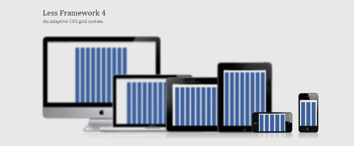
Less Framework It is created for 4 layouts that include tablet, default, wide mobile and mobile along with three sets of typography. Less framework is a responsive CSS grid system, used to design the robust websites. It provides a layout of 992 px, and also caters the CSS3 media queries for various child layouts such as 768, 480 and 320 px.
Skeleton: Responsive CSS Boilerplate
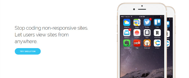
Skeleton It is a straightforward and beautiful responsive boilerplate for CSS/HTML5 websites. Skeleton is created on a 960 lightweight grid that has the ability to curtail windows, mobile, and tablets. It is designed for quick development that is developed with a structured grid and CSS practices. However, it is more of a development kit than a framework, which means it supplies basic styles, but has the capability to adopt new design or style.
Twitter Bootstrap

Bootstrap It has become one of the most impactful frameworks among the web developers. Bootstrap framework is created to make front-end development simpler and accessible for the users. It is easy to manage and best for all the sizes. It enables you to develop anything you want without any complication. Designing a mobile-friendly layout has become simple with the Bootstrap. In fact, it can measure your project with the single code base that can be applied from the PCs to the mobile phones.
Base
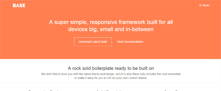
An easy responsive framework is designed in SASS/LESS, an impactful CSS pre-processor. Base helps you to write well-structured HTML/CSS in an organized manner. It is developed to make it accessible from the tablets, mobile phones to the PCs and notebooks.
Foundation

Foundation is another impressive responsive framework, provides flexible and effective grid that can easily be deep-seated. Also, allows the user to create entangled layouts without creating ample number of custom elements. Foundation framework also offers rapid prototyping feature, an effective and responsive grid system. It optimizes the mobile version as it focuses on mobile-friendly sites.
HTML5 Boilerplate
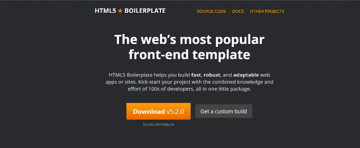
In the year of 2010, HTML5 Boilerplate has become one of the incredible and exceptional web development tools that help in creating HTML5 Websites. Moreover, it offers mobile-friendly placeholder icons, HTML template, CSS boots for regularizing the standard media queries.
Query /JS plugins & Scripts
Isotope
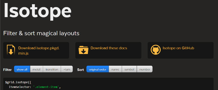
Isotope is an amazing jQuery plugin that plays an imperative role while creating responsive conversions. Isotope not only caters to redo the elements of a website when the size of the browser window changes, but also dribble these components.
Masonry
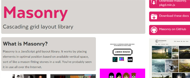
Masonry is a great jQuery plugin, developed to make adjustments and provide flexible formats. Masonry has become one of the unique plugin, which is used to alter the essential components in the responsive sites.
TinyNas.js
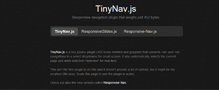
TinyNas.js is a lightweight jQuery plugin that has the ability to change the gigantic records into a well-organized drop down menus for mobile platforms.
Slick
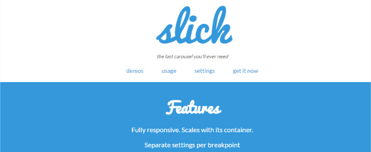
Slick is one of the most flexible plugin that can tackle slider carousel requirements. Through this, the user can view the cluster of images briskly on their mobile phones. You can also put the scrolling image quickly in the centre mode with the help of the transition effects such as fade.
Conclusion
Hopefully, the post has given you appropriate information about the first- rate frameworks for the responsive conversions. In fact, the web designer and developer puts efforts to create a hassle-free responsive websites as it has become mandatory for all the websites as per the latest update with the Google search algorithm.
Posted by Lucy Barret

Related Posts

Lost your iPhone? Well, it can be a pretty scary experience, but we promise you that not all hope is lost.

Creating a successful mobile app is a journey, not a sprint. From initial concept to launch, designing a modern and effective app is a multi-layered process that typically demands a significant investment of time, often spanning several months or even a year for complex projects.


If you own a business, you know how important it is to remain at the forefront of your customer’s awareness. If you aren’t visible to your customers, you can’t succeed at retaining their business. Likewise, if it is too difficult to work with your company, many customers will go elsewhere.


Comments
comments powered by Disqus