
How to increase a percentage of registrations with the design of forms?

As a user, registering for websites/apps is no fun. Because it's on a computer, it's only slightly less annoying than filling out paper forms, this article will help developers to try and make registration as painless as possible.
Login and registration forms.
It seems what can be easier then registration form and, even more so, login the site? A pair of fields and a button. But in the nuances of this simplicity is hidden the success of the work performed and the number of users of your service. How to make the forms easier, process more pleasant and thus reduce the number of bounces?
- What is the mechanism of registration and user login?
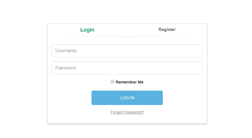
- Login form
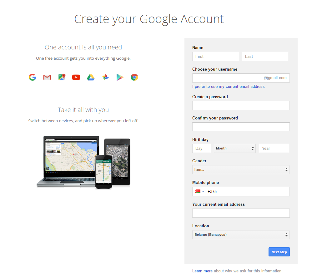
- Registration form
- Reminders or password reset form
- Message after a reminder or reset password
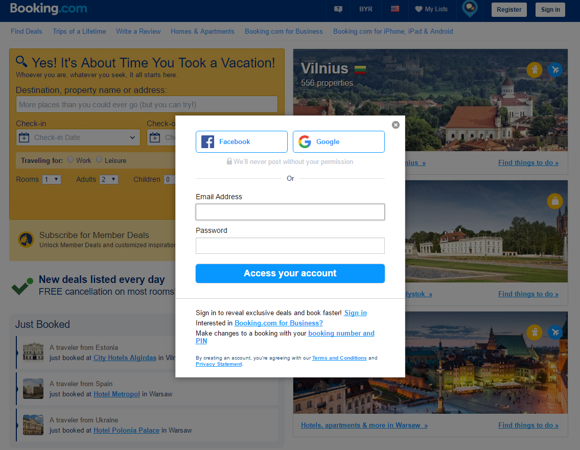
- Registration via social networks
This is the necessary minimum. It must be put together and get a single, user-friendly mechanism of entering.
Methods of implementation.
Login form
Tabs.
Separate pages.
Popup
All on one page
Step by step process
Of course, it is possible to combine different methods. For example, the tabs in popup or extended tabs with details as separate pages. As there is a specific registration, which require a special approach, for example, online banking.
How to make registration more efficient.
Humanity. Be the man, do not keep doing what you can for yourself. Some information can be determined automatically, for example, gender or city. If this can not be done, then after registration you can specify the missing information. Fewer fields than the better.
Spent time. Show in seconds how fast registration is, if this is true. Nobody wants to waste their precious time. The cursor should automatically rise to the first form field.
Captions. Write the names of the fields is better above them and not beside. So look man slips from top to bottom, instead of "inverted Christmas tree."
Correctness. Error messages should be written for the common man understandable language, and not in technical terms. They should appear next to each field separately, rather than heap somewhere in one place. Also need to highlight the text fields themselves. And possibly writing tips. Ideal would be to check the correctness of the data entered at once, without reloading the page. For example, it is very convenient when invent a nickname. Please flag correctly completed the fields, such as ticks. This is good in the process of filling the entire form.
Security. It should be user agreement privacy policy and a link to a user agreement. For safety of input data tell that you do not pass any information to third parties.
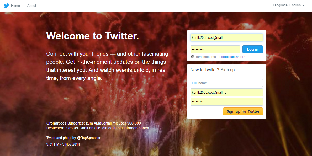
Password. Ask for a password at most once. If a person is sealed and could not enter, he will restore the password. Or do not ask for the password, and generate and send it in the mail. If you still ask it, give the opportunity to see when person enter it. It is not often we have someone standing behind us.
Social networks. Let's take the opportunity to go through a social network. Immediately. It's fast and convenient. You can generally leave to enter only social network. This option makes it impossible to make a lot of mistakes, but it is for a young audience. You can lost if your target audience is older than 40.
Checkboxes. Most often, we usually use our own device, rather than a stranger. Therefore, in order not to make use constantly to log in, you need a tick "Do not remember me." And if a person clicks it, it will automatically log out when you close the site. The wording may be different, for example, "Stay signed in" active tick. Do not sign on the default a mailing.
If you like this article, maybe you'll also like my previous one.
Conclusion:
We hope this simple set of useful tips will help you reduce the number of bounces during customer registration and increase your profit.
Posted by Vadim Kononyuk

Related Posts

A business website plays a critical role in how customers discover, evaluate, and interact with a brand.
In the world of JavaScript programming, asynchronous operations are a fundamental concept that every developer should grasp. Asynchronous programming allows your code to perform time-consuming tasks, such as making HTTP requests or reading files, without blocking the execution of the rest of your...

WordPress is the backbone of over 40% of websites on the internet, making it the most popular content management system (CMS) globally.

A web app development has been ruling the world for a very long time. Customers are eager to invest in web app development as Paws has made things easier for the users.

As the world of eCommerce continues to evolve, businesses are constantly seeking ways to stand out in the digital landscape. According to a report by Statista, it is predicted that global online sales will reach an impressive mark of $6.5 billion by 2023.

For startups in 2024, there are few aspects as important as web development.


Comments
comments powered by Disqus