
Android vs. iOS: The updated GUI comparison of Two Tech Giants
A decade has gone by, and we have already started on a new 10-year journey.
Many people find it amusing to label things as the 'best of the decade' gone by. Rightfully so, you must be thinking The Avengers End Game was the epic best battle of the decade. But I'll stop you here because with significant technological advancements happening every day, the real end game has just begun.
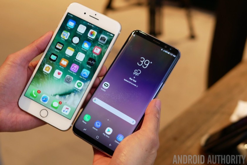
According to research, as of 2018, there were more than 80% worldwide Android users. But the iOS usage was as low as having only 12% of consumers.
Although there are many factors involved as to why people prefer a particular platform over the other, these percentages further validate one thing, which is the fact that these two platforms are the only two giants sharing the whole industry among them.
War of The Giants – Android vs. iOS: Comparing GUI Components
The mobile brands seem to have little to no choice when it comes to developing their latest devices to the best software platforms. Either your brand is associated with Android, or there are Apple products as your competitors to prove otherwise. None the less, consumers seem less divided with this choice. Distinct GUI components of both the leading platforms that serve their purpose keep the loyal consumers long-term.
Let's find out what exactly those are, shall we!
Typography
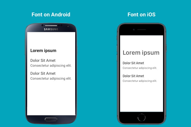
Both systems adhere to their own set of default fonts recommended to the users. Android presents Roboto as the default main font style for the system, whereas iOS presents San Francisco. However, many Android phones allow the use of other font styles by having downloadable font packs on the play store. These font packs have a variety of font styles to choose from and change the font style throughout the Android device without a reboot or other harmful installations like rooting.
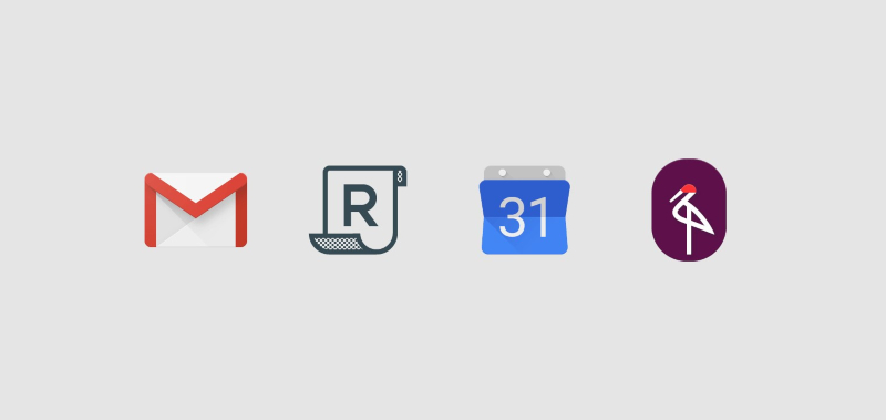
Application Icons
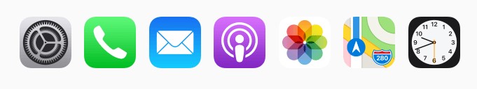
App icons are probably the most distinctive of all GUI features of the two leading giants we are discussing. The user's first visual accommodation with the brand is through app icons. And to understand the interface better, one should first get acquainted with the app icons and then move on to other features.
Android allows transparent background with their app icons and range of colors to choose from. This gives great options to the app developers for designing icons just as they may seem fit in the designated area. It is why many Android users will agree that they usually see software and application logos only as the app icons in their devices.
However, Apple's approach towards their icons is different in the sense that they like clarity and concise spacing for their apps. They are created square-shaped with automatically rounded off corners for a clean and sleek design.
Navigation Bar
An Android Navigation Bar is usually a three to four access bottom bar that allows you to navigate easily through your device. Updated technology has led to phones having all-screen and no bottom button option. Therefore, this navigation bar is on screen and can even disappear on command. The three options it offers are:
- A last activity opener that allows you to check your active apps
- A phone menu or home button placed in the center
- A back button that will enable you to go back to your last activity
As far as iOS is concerned, Apple doesn't integrate a bottom navigation bar in its products. Instead, they have a single home button in the bottom center that allows the user to go to the main home menu directly and also serve as Touch ID, a fingerprint-based security system.
Face ID vs. Face Unlock
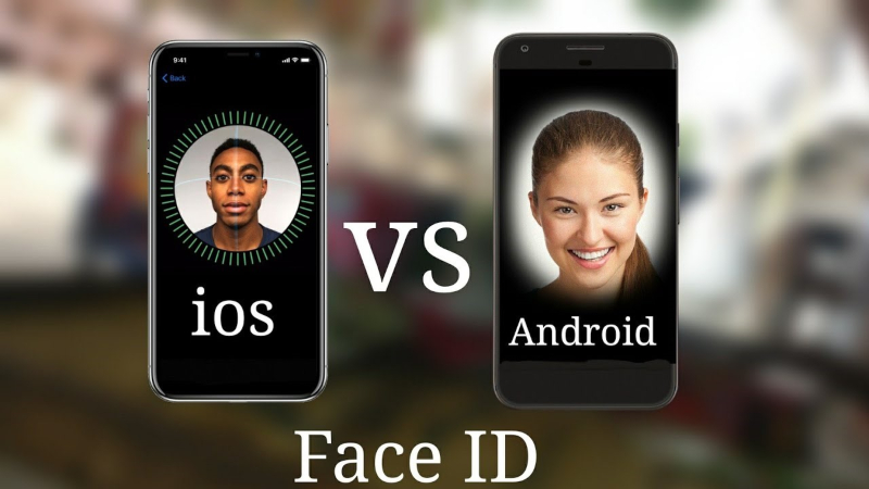
Apple first introduced Face ID on its flagship iPhone X in 2017. It was a biometric authentication succession to Touch ID, the fingerprint security system previously being used. The technology is advanced, and Apple perfected every little GUI detail of this security feature to perform with the utmost accuracy. According to Forbes, Face ID works "by creating a 3D map of your face by using a combination of infrared light and image capture. It uses infrared (IR) light to illuminate your face while capturing the images, to work day or night, outside or indoors. IR spans wavelengths of electromagnetic radiation (known commonly as 'light') just beyond the visible spectrum, so iPhone X's display won't dazzle you in the dark."
As per Android, the platform has had similar technology since 2015 called Face Unlock, now known as Trusted Face. But it is nothing as advanced as Apple's Face ID. In fact, it falls far behind the perfected craft of updated 3D imagery for added security. As compared to Face ID that works with makeup, beard, scarves, glasses, and hats, Face Unlock can easily be fooled with just a printed picture of you.
Dialog Boxes
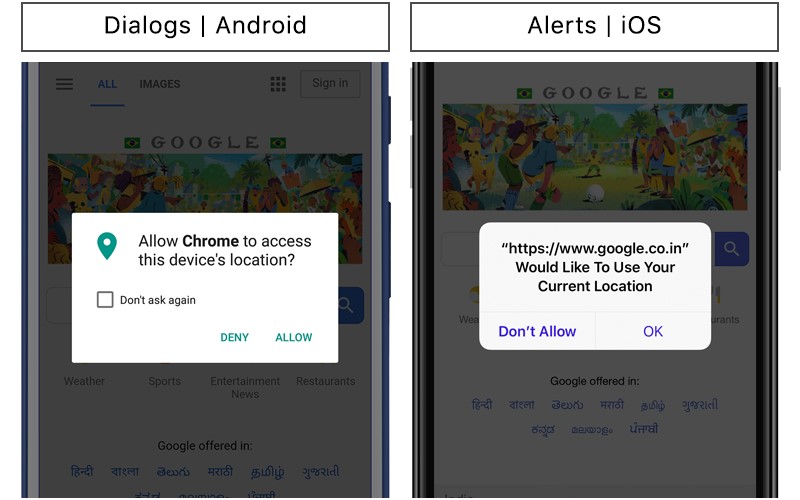
Called Dialogs for Android, they are mainly pop up notifications that present a floating window on your activity tab. Like the name, Dialogs are a two-way command prompt, which usually has two buttons as a clickable answer: one to accept and the other to decline whatever the notification says in the said dialog box.
Apple devices have named such notification popups much to their nature as Alerts. The contents of said boxes are usually important information, notifications, and alerts of the currently active application. Their visual appearance is fixed by default, and so are the command answers. The user can Accept, Cancel, Allow, or Don't Allow depending upon what is being asked.
Page and Scroll Viewing
Much to the dismay of both Android and iOS users, these features are not as distinct as others. It is just as easy to navigate among browser pages, books, calendars, or documents in Android as it is in iOS. A particular application may present a different GUI for page and scroll viewing. For example, Amazon Kindle has a different GUI approach for iOS than for Android. But other than that, default viewing setups are just as same both performance and visual wise.
Bottom Line
In conclusion, there is no end to this epic battle of the giants. As long as the technology will keep advancing, there is no stopping to the cool new features that are yet to come!
Posted by Claudia Jeff

Related Posts

A business website plays a critical role in how customers discover, evaluate, and interact with a brand.

Lost your iPhone? Well, it can be a pretty scary experience, but we promise you that not all hope is lost.
In the world of JavaScript programming, asynchronous operations are a fundamental concept that every developer should grasp. Asynchronous programming allows your code to perform time-consuming tasks, such as making HTTP requests or reading files, without blocking the execution of the rest of your...

WordPress is the backbone of over 40% of websites on the internet, making it the most popular content management system (CMS) globally.

Creating a successful mobile app is a journey, not a sprint. From initial concept to launch, designing a modern and effective app is a multi-layered process that typically demands a significant investment of time, often spanning several months or even a year for complex projects.

A web app development has been ruling the world for a very long time. Customers are eager to invest in web app development as Paws has made things easier for the users.


Comments
comments powered by Disqus