
3 Effective Ways to Adapt a Website to Responsive Design

As more and more people are adopting smartphone and tablets – and given the fact that users prefer to access the web on their handsets other than their desktop – there has been a significant rise in the demand of mobile-friendly websites. And every serious designer is looking out for ways to make the process of making a website responsive as painless as possible.
Understanding the Responsive Design Basics
Getting a website adapted and adjusted to a responsive design means that the site should automatically fit to the device that is used to access it. Any responsive design enables users to view it across different screen sizes. Responsive design mainly depends on a mix of flexible grids and media queries.
Even Mashable recently gave importance to make more and more websites adopt responsive design, in order to keep pace with the devices (like smartphones and tablets) that are increasingly being used by users to access the web. By adapting a site to different devices will help solve the resizing problems, and will lower down the rate of users who abandon a site if they find it difficult to access the content properly.
Every designer should search out for ways that makes it possible for them to carry out the transition with ease. Most importantly, they should find ways to make a site optimised for smartphones as well as tablets. In this post I've listed the most important ways following which a website can be easily adapted to a responsive design.
Know Where Your Responsive Design Works
Experimenting with responsive design is a good idea, especially if you aim at simplifying the process of how a site appears in different browsers. However, it's important to know where responsive design works, as they might not be effective at places (sometimes, though not all times).
Users may not like your new website layout after it is being tweaked – to give a new look and feel to your site design. Besides, it can be difficult at times to be in line with different device specifications beyond current standards. The problem is, if a site mainly includes text, then automatic resizing can cause distortion of columns.
The solution is to stick to a mobile-compatible website, which can be loaded in major browsers. Another alternative is to pay heed to native as well as mobile apps with up-to-date content.
Flexible Grid Approach
Before making a jumpstart to designing a responsive web design, it's necessary to decide on all the screen sizes that you want your design to be compatible to – be it wider or small desktop screen, smartphones, tablets etc. Designers need to target these devices for creating responsive design. For doing so, it's important to view specifications of each of the platform.
Designers can make use of flexible grids with CSS3 and HTML5 formats for creating responsive visuals for websites. Flexible grids work inside containers that helps to set minimum dimensions, based on how a device is recognised by a browser. I went reading an article at StudioPress where CopyBlogger media specialist – Josh Byers at suggested a formula to calculate the dimensions of devices
2em/* 32px/16px */
Josh further said that adapting this formula while coding a website will ensure that the page does not appear to have wrong resolution or dimensions.
Media Queries – The Most Vital Tool for Responsive Design
Using flexible grids approach won't suffice. You'll have to combine it with media queries in CSS3; media queries allows to use different CSS rules based on device type and browser width. Using media queries different CSS styling is applied to dissever screen sizes, making it possible for designers to build websites that are visually appealing and can be read easily even on small screen devices to large screens.
Let's take an example of a user having a small device such as a smartphone and giving their site a specific layout that fits to their smartphone screen. The UK web conference dConstruct used media queries to launched their site for iPhone device.
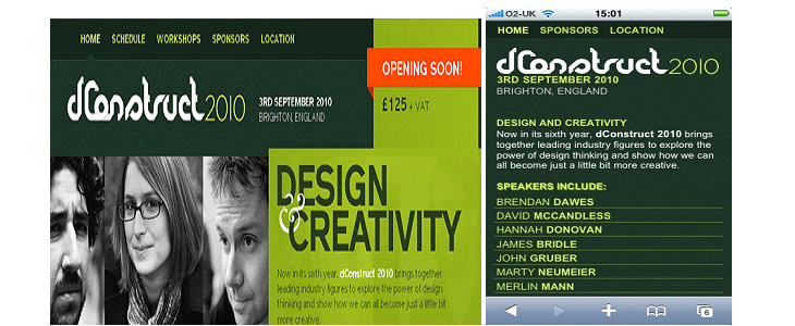
As you can see in the screenshot above, the site isn't just adapted to fit smaller screen but the content has also been revised to make it readable on small devices as well.
Final Thought
Responsive design is here to stay and thus, it is important that you should adapt your website to different screens of devices. If you don't want to lose out to the cutthroat competition, out there in the online marketplace it is important to get your website fit for the desktop as well as mobile devices. Most importantly, designers need to look at various aspects to make the existing website boast a responsive layout. Using flexible grids together with media queries is the most effective means of making a site optimised for devices.
Posted by Sarah Parker

Sarah Parker is a blogger cum WordPress developer. She loves writing information-rich blogs on PSD to WordPress conversion services and social Media. Currently, she is employed with Designs2HTML Ltd, a leading markup conversion services company that has delivered top-grade markup conversion services since 5 years.
Related Posts

A business website plays a critical role in how customers discover, evaluate, and interact with a brand.
In the world of JavaScript programming, asynchronous operations are a fundamental concept that every developer should grasp. Asynchronous programming allows your code to perform time-consuming tasks, such as making HTTP requests or reading files, without blocking the execution of the rest of your...

WordPress is the backbone of over 40% of websites on the internet, making it the most popular content management system (CMS) globally.

A web app development has been ruling the world for a very long time. Customers are eager to invest in web app development as Paws has made things easier for the users.

As the world of eCommerce continues to evolve, businesses are constantly seeking ways to stand out in the digital landscape. According to a report by Statista, it is predicted that global online sales will reach an impressive mark of $6.5 billion by 2023.

For startups in 2024, there are few aspects as important as web development.


Comments
comments powered by Disqus