
Would You Like a Hamburger... Menu?
A hamburger menu is the icon, typically located in the upper right or left of a screen, that’s basically three fat lines stacked one on top of the other. It resembles two hamburger buns with the filling in the middle. When you click on it, this icon pulls down menu choices to help you navigate a website.
A hamburger menu is the icon, typically located in the upper right or left of a screen, that’s basically three fat lines stacked one on top of the other. It resembles two hamburger buns with the filling in the middle. When you click on it, this icon pulls down menu choices to help you navigate a website.
Why Some People Dislike Hamburger Menus
In 2014, Tech Crunch lambasted the hamburger icon, calling it “the devil.” Their reasoning? It’s a bad choice because the menu is hidden behind an icon that doesn’t really explain what it is or what it does.
When site visitors can't see the menu, it is not something they think about. Tech Crunch also pointed to the fact that you have to tap the icon before you can even see what is behind it, which some visitors won’t do.
Why the Hamburger Menu Works
Despite all the criticism, though, hamburger menus have become more commonplace in the last year or two. People instantly recognize those three fat lines as a menu icon and know they can click on it to gain access to a website’s navigation structure.
Additionally, about one in every 10 of those browsing the Internet in the U.S. do so exclusively through their mobile devices — and screen space is at a premium on smaller screens. The streamlined feature of the hamburger menu allows you to present your landing page on a smaller screen in a way that is responsive to that browser.
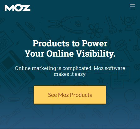
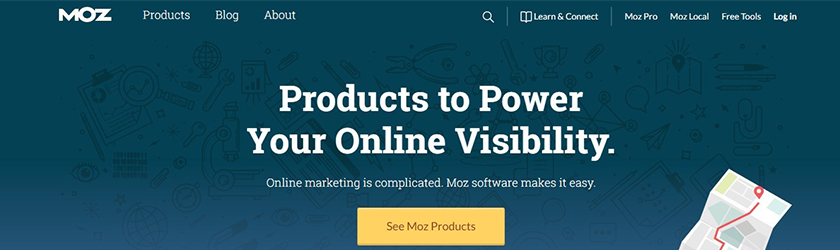
Moz uses this technique and has different screen optimization to determine which navigation option the user sees. The tablet and phone screens receive a hamburger menu, and the desktop screens view the standard navigation bar.
Yes, you can offer other options or even just use the word “menu” and a slide-in navigation menu, but even that takes up more room than the hamburger icon. And some sites offer both navigation options as well.
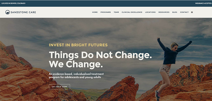
For example, Sandstone Care has the hamburger menu as well as the regular navigation options in the top bar. This gives the user two choices and allows them to decide which way they’d prefer. In addition, many themes are now integrated with this menu archetype.
Tips for Using Hamburger Successfully
There are a few things you can do to ensure your hamburger menu is more useable for your site visitors:
- Choose a recognizable icon. Essentially, you want the three-line stack that is standard for this type of menu.
- Choose an icon that is bold enough for the reader to see at a glance. There are many different ready-made icons available, or you can create one in colors that match your site’s theme.
- Place the icon in a standard location (top right or top left).
- Consider how much of the screen the slide-in menu will take up. Will links be hidden to make the viewing more streamlined for those clicking on the hamburger menu? For example, if you have a few links down the left side, you could have the menu slide in from the left and cover those links.
- Consider adding text that says menu and the icon directly to the right of the text.
- Use a hamburger menu for some areas of your site and not for others — for example, to access bonus info but not to access the shopping catalog.
- UExperiment and use the icon on your desktop and your mobile site. Use A/B testing to see how effective the icon is with your users.
Advantages to the Hamburger Icon
The reason the hamburger icon continues to be used, even though some have put a price on its head, is because it affords a simple look that allows for clean lines and a minimalist approach to web design. It also limits choices, which can funnel visitors to where you want them to go.
However, because it is still more of a mobile responsive design choice, if you do choose to use a hamburger menu on a desktop site, be sure you include a Call to Action (CTA) and make it clear that there are additional menu choices to be had by clicking on the icon.
Posted by Lexie Lu

Related Posts

Staffing shortages are squeezing hotels on both sides of the Atlantic.

One thing you don't want to do is have a LinkedIn post that sounds either too stiff or too casual.

Modern marketing professionals are turning to sophisticated tools to streamline their networking efforts and expand their reach on professional platforms.

In the ever-evolving landscape of digital marketing, paid advertising has become the cornerstone of success for businesses aiming to capture the attention of their target audiences.


Comments
comments powered by Disqus