
Title: Best Practices For Guiding Design To First-time Users

It's hard to get a registered user for the product. It takes a lot of time, experience and money to get the users.
But when users use these products first-time, they are leaving the application immediately due to the bad user experience, this leads to losing hard-won users to the product.
According to the research studies, ordinary applications lose 77% of daily active users every day for the first three days.
You definitely don't want to happen this to your company, investing a lot of resources in getting new users, and most users leave just after the first visit is not at a good sign. You should think about how to improve this situation? That is, you need to make a great first impression on the user by creating a perfect access process in the application.
Mentoring is borrowed from the vocabulary of human resources, and the intention is to help users get started quickly when they first visit websites, applications or services.
When designing a guide, designers often need to consider a range of factors to help users become familiar with the product in the best way and know what value the product gives them.
1. Avoid Excessive Guidance
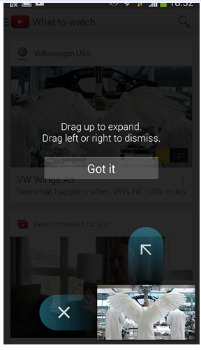
Follow the simple principle of "less display, more delivery" to reduce the inconvenience of users starting to use the product. Almost all applications on the market currently provide a sliding gesture scrolling guide page when the application is first opened. Its purpose is to introduce the user to what kind of service the application can provide to the user.
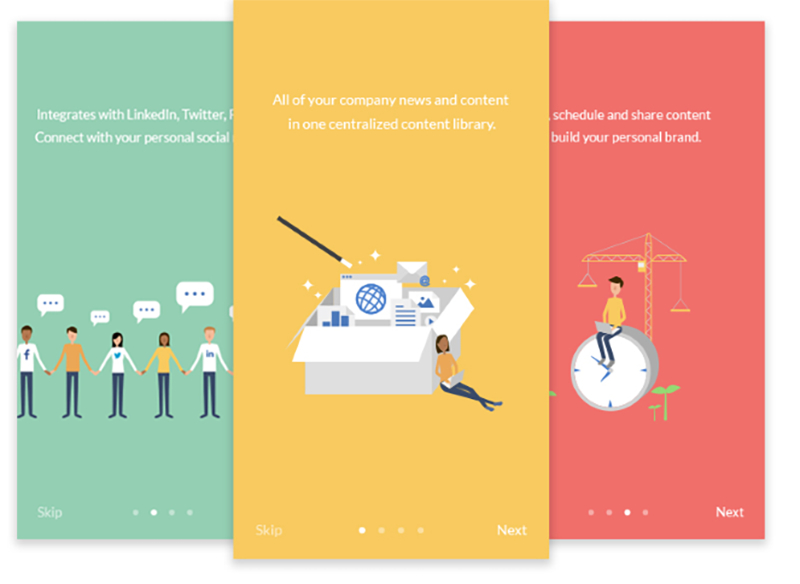
Or use these pages to explain some common ways of interacting.
However, there are some problems with this type of guidance used by many applications: Sliding gestures scrolling pages are obstacles for users to explore application power. It creates a gap between the user and the application, even if these guide pages are designed to be beautiful and interesting, but the user does not have the patience to read them. why? Because most users expect to be able to explore the product on their own, connect with the app and see what the app provides.
We should not expect users to read the manual before using the application. Users don't download apps to learn these interfaces, they just want to do what they want in the shortest possible time. So don't let your users feel that they need to do extra learning before using your app.
2. Context-Based Design Guidance
Instead of letting the user remember everything in advance, it is better to provide the user with the right guidance at the right time.
The pre-built guide page also has a usability problem. It requires the user to do their homework in advance, the user needs to patiently read all the information and try to remember it. Even if the user decides to read these instructions carefully, they often forget all the content they just read when they close these pages (because unfortunately, our short-term memory can't remember too much information).
New users don't register your product because they are only interested in learning the user interface of the product. They sign up because they are interested in the value of the service promised by your product.
A situation-based (or timely) boot method is a good alternative to static boot pages. It always provides useful information to the user at the right time: to give the user some guidance at a specific moment in the process, and only provide the content needed for the interaction at that moment. This simple and effective design technique can be applied to many different places:
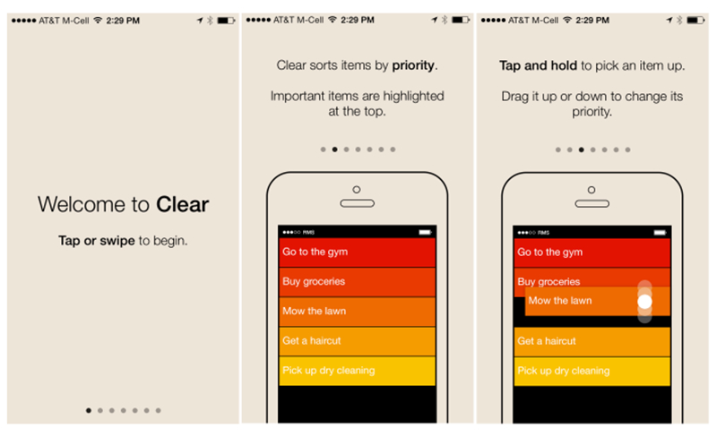
3. Sample Data In The Welcome Screen
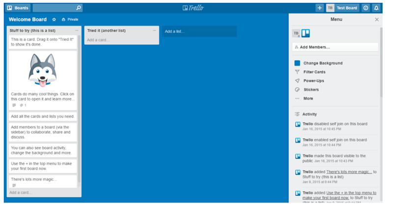
"Welcome Screen" is the interface that the user sees at the first sight of the task management application Trello. The interface not only has some default entries of the system but also provides an explanation for the interaction or function of each entry. This approach provides users with a more effective learning method than static pages.
Highlight the key points. This type of situation-based prompt can be found in the Android app for Android. The application minimizes the number of prompts to focus the user's attention on one operation with a relatively high priority. It uses a mask to explain to the user the uncommon interactions that occur only when a new user first enters, and only when the user first enters the relevant module of the application, displaying only one at a time.
Interactive booting, a user-directed way to boot, which occurs when the user has the appropriate experience. Therefore, the order in which different users get booted may be different. Duolingo knows that learning by completing tasks is the best way to learn, and to show users how products work in a step-by-step interaction. It encourages users to start and perform a quick test based on the selected language.
4. Display Success Feedback
When the user gets the first small success, let your users feel great. The moment when users complete an important task is a good opportunity to build a positive emotional bridge between the product and the user. This is to let the user know that they are doing well in the process of learning and execution.
Celebrate Success With The User
For example, MailChimp, a product that sends and receives mail through a web page, encourages users to write their first email and develop a delivery plan through unexpected humour and positive feedback throughout the process.
Tip: Using successful feedback is a great opportunity to showcase your product's personality.
5. Trade Offs
Indicators are important for reviewing the success of current guidance methods and identifying areas for improvement. Therefore, it is necessary to establish a long-term effective metric and continuously collect relevant data. Before starting any new boot design, you should ask yourself “How will the project enhance existing metrics?”
Summary
Guiding the design can help the product succeed or it can ruin the product. Before you lead the design, think about what the user's first experience will be, think about these first-time experiences to help users improve their lives, this emphasis should not be just about getting new users to click around or Familiar with the interface, but help them use your product to achieve their purpose.
Posted by Kiran Gutha
Related Posts
In today’s digital age, a school’s website is often the first point of contact for prospective parents, staff, and the wider community.

In today’s digital world, businesses face a tough choice: tailored solutions or ready-made templates?

The rapidly changing landscape of e-commerce demands businesses to create a compelling online presence. However, establishing a formidable online store demands much more than a mere digital replica of a physical storefront. It requires a deep understanding of human psychology and a strategic...

Recently, stock photos have become a popular choice in design.

With the digital world picking pace and setting high benchmarks for the upcoming ideas in the industry, the upcoming digital decade is likely to experience much improved and robust digital ideas.

Over the years, businesses have shifted from a traditional to an online mode of running their operations. Business owners are learning to leverage digital platforms to their benefit.


Comments
comments powered by Disqus