
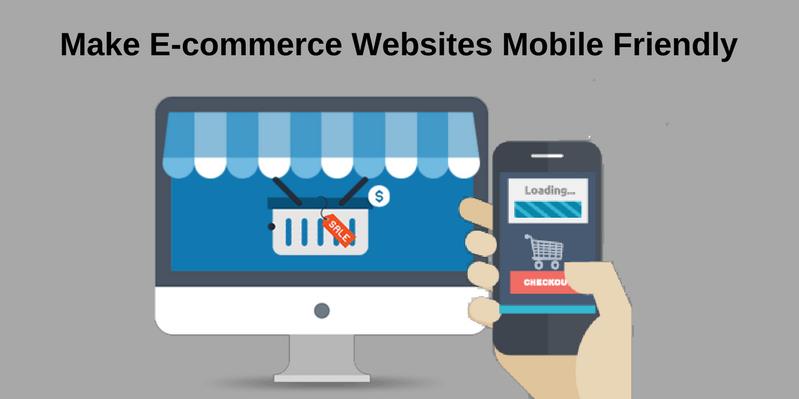
Perfect Guide To Make E-commerce Websites Mobile Friendly
With the rapid development of smartphones and tablet technologies, the Internet world is witnessing a significant change.
Now, more than 50% of shoppers are using different mobile devices to browse the Internet and do online shopping. The surprising thing is that their numbers are increasing with each passing day.
E-retailers and entrepreneurs will lose a lot of business opportunities if their E-stores are not responsive to mobile devices. Apart from this, Mobile Friendly’ design is a compulsory parameter if they want your site to rank well in Google search results. All those sites that are not responsive to mobile devices are punished by Google with a low ranking in its SERP.
So, are you looking for ways to make your E-commerce site mobile responsive? If yes, then you should follow the below-mentioned tips. These useful tips will help you to make your site responsive to all mobile devices, increase visitor count and opportunities of earning easily.
1. Build A Mobile Version Of Your Existing Site
If you have enough budget, manpower, and resources, you can create a mobile version of your desktop site using conversion platforms such as Duda Mobile or bMobilized. When visitors search your website on their mobile devices, they are automatically redirected to the mobile version of the site.
It is very difficult to run, update and maintain two different versions of the same site. On many occasions, visitors express their displeasure when they get less information on the mobile version of your site compared to the desktop version. Keep these things in mind while creating a separate mobile site.
2. Attach Mobile Plugins/Extension To Your Site
If you don't want to create the mobile version of your site, mobile extension/plugins can be used to take the E-commerce business to the mobile platform. For example- If you want your Magento E-commerce site to appear prominently on all mobile devices, just add a Magento extension to the website. The same holds true in the case of WordPress, Joomla, Drupal, and other similar platforms.

3. Opt For A Mobile Responsive Site Design
By choosing a responsive web design, you can easily make your E-commerce site mobile responsive with a little investment. Responsive websites automatically adjust itself to the different screen sizes and allow the visitors to view the site easily. Thus, such websites have higher traffic and a lower bounce rate. In order to fully capitalize the business coming from small screens and increase your ROI, you should create/redesign your E-commerce site with a mobile-first approach.
4. Make Use Of Responsive Themes
By using the responsive themes, you can easily increase its compatibility with different mobile devices. It helps the different elements of your site to adjust itself automatically to the size of devices used by the visitors and offer them the optimal browsing experience. It also helps visitors to switch between PC and mobile or vice versa at any time and gain the same view.

5. Mobile App
These days, the use of mobile applications is skyrocketing. In order to avoid the mess of typing website names in web browsers each time for online shopping, a good number of tech-savvy people download the site's app on their mobile devices and conduct online shopping from all locations.
Therefore, to increase your customer base and sales, just get your site's App made and list it on Google play store, Amazon App Store, ApkMirror, AppBrain, Aptoide, and other similar platforms. Encourage people to download your app on their mobile devices and use it to buy products from your E-commerce site.
6. Take Care Of Site's Loading Speed
When you implement RWD on your E-commerce site, you should take note of its loading speed. Your site or its pages may become slow if you use too many graphic elements. Therefore, you should use only necessary elements on your E-commerce site, compress your web pages and take all other steps (such as image optimization, erasing needless database, plugins/extensions, etc,) to make your E-commerce site fast. It will help visitors to easily access your site on their mobile devices.
7. Precise Content
Always keep in mind that mobile devices have less space to display the webpages. So, if your website is flooded with excessive content, unoptimized images, etc, visitors browsing your site through mobile devices will face problems to access it's all features. Therefore, Whenever you create webpages, keeping mobile users in mind, you must display your products with minimal text. As most of the visitors on mobile devices tend to scroll down the page, you should try to keep your content in a vertical line, not in horizontal line.

8. Provide Touch Screen Navigation
Navigation features differ a little bit when you visit websites on PC and mobile devices. These days, most of the mobile devices involve a touch screen. Therefore, you must add clearly visible, large, and bold CTA buttons. This will make your site more professional and will help visitors to complete almost actions on your E-commerce site.
9. Avoid Using Excessive JS Files
JavaScript files behave differently with different browsers and devices. If you use excessive JS files on your mobile websites, then its performance will be affected badly. Therefore, you must try to avoid the excessive use of JS files as far as possible. It will help your site to perform well on all mobile devices and visitors will be able to easily navigate more pages in less time.
Final Words
E-retailers need to make their website responsive to build a solid online presence, reach out a large number of shoppers and grow their business rapidly. These are some tips using which you can easily make your site responsive to mobile devices and meet the ultimate goals of your E-commerce business.
Posted by Linda Wester
Related Posts

Staffing shortages are squeezing hotels on both sides of the Atlantic.

Shopify is a popular choice among entrepreneurs for creating an eye-catching online store that drives sales. Shopify offers an easy-to-use platform with numerous features, but many businesses seek assistance from Shopify experts or agencies to maximize its potential.


There is fierce competition in the corporate sector. If you want your company to reach its objectives within the allotted time, you must find strategies to differentiate yourself from the competition and maintain your competitive edge.

Technology is evolving at an unprecedented pace and while this presents an array of opportunities for businesses to use the latest digital solutions to excel in their respective industries, it also exposes them to a myriad of cyber threats.


Comments
comments powered by Disqus