
Most Important Web Design Elements

There are so many reasons why businesses need a website. Business owners cannot and should not underestimate the value of a website and using unique web design elements.
If your business does not have one yet, you need to make it a priority to create one right away. Your website is absolutely one of the most essential and powerful tools you can have to increase client acquisition and customer retention. But not all websites are created equal. Web design elements can separate a good website from a bad one. Remember that a website is an investment, and as with all your other investments, you want a good ROI.
With one visit, people can decide whether they want to trust you or not, whether your website is of value to them or if they should never, ever come back. You need to make the best first impression you can give, because you want your visitors hooked, lingering, and converting to valued customers eventually.
If your website was just an afterthought or something you came up with because you had some extra funds, you need to rethink your strategies now, as there are almost 4.54 billion people active internet users to date, encompassing 59% of the world’s population. So, if done correctly, a website can be an investment that helps you grow and make money or an expense down the drain.
Top 10 Web Design Elements for Website
Web design is more than just aesthetics and visuals; it dramatically affects the SEO ranking of your website, strengthens brand awareness, and can help increase the conversion rate of your website.
1. Clear Goals
Your website needs to have a clear focus on the theme, content, and target market. If you start a website without having a clear focus on the identity of your website and the results you need your site to deliver, you will not be able to optimise your website and provide robust strategies. Know the current trends in your niche and how to design for that market. Set realistic goals that coincide with those trends and your capabilities to keep up. Determine how often you want to release content at the very beginning so that you can be guided on scheduling article-writing, image or video production, promos, and even related social media campaigns. Purchasing your domain is also a worthy investment. Your domain name should be catchy or memorable, easy to type, and SEO-friendly (no dashes, unusual spelling, unique fonts or characters, and the like).
2. Intuitive Design
There should be a balance between form and function, or design and usability in every well-built website. The User Interface or Design (UI) and the User Experience (UX) on your site are included in the many factors that SEO algorithms check to compute SERP rankings. The higher the UI/UX, the higher the SEO ranking. Hence, the design should be well-thought-of and on target as well.
In terms of design usability, frills are never more important than the essentials of web design. The essentials include the “About us” portion, which answers basic questions about you and your company, so readers get the feel of who you are. If the readers relate to you or find you interesting enough, they will keep browsing through your page. Make your story short, but compelling that the readers would be curious to learn more about you.
Functional web design is pleasing and user-friendly, navigable with easy-to-find contact information and simplified options for visitors. Providing your visitors with fewer options helps them linger your website. A “crowded” webpage tends to turn readers off as quickly as they clicked to open your page. Also, be updated with current design trends and use that to guide your design process in producing fresh, relevant content all the time.
FreshBooks gives a great example of what a simple, yet striking and effective web design looks like. HubSpot Designers say FreshBooks’ design is brilliant because “it’s easy to consume. There is much debate on whether short or long homepages work better. If you choose to do the latter, you need to make it easy to scroll and read—and that's exactly what this site does. It almost acts like a story. There's a great use of contrast and positioning with the primary calls-to-action—it’s clear what the company wants you to convert on when you arrive.” The homepage has a strong call to action, “Try it Free for 30 Days.” Its sub-headline is straightforward—accounting software is “painfully complex”—and clearly stated they want to help you, just like the other 5 million people they have helped using FreshBooks. The software has grown to 10 million users worldwide despite the expensive monthly costs after the free trial. That conversion rate makes it all the credible, and their dominance in that niche even more apparent.

Image Source: MailChimp
3. Persuasive Call to Action (CTA)
Do you want more email subscribers or conversions? You will not get them without a compelling Call to Action fit for your campaign. No matter what your
advertising and marketing goals are, you won’t do it without the right CTA. Your campaigns and other content must have a well-crafted CTA designed to drive action.
Strong conversions lie beyond strong CTAs. Walk visitors through the sales conversion funnel, beginning with a compelling CTA. Users often leave web pages in 10–20 seconds, unless they have a clear value proposition. To gain several minutes of user attention, websites must clearly communicate its value proposition within 10 seconds. Avoid using vague and complicated words. Surveys found out that people want to be guided directly, more than being kept guessing as to what you want them to do. “Find out More” is more precise than saying, “Still Curious?” The second CTA leaves so much room for questions than the first one. “Still curious about what?” your readers might ask. You cannot just assume it’s common knowledge. The burden of clarity falls on you, the webpage developer, and not the reader. Direct commands like “Click Here,” “Get the Discount,” “Buy Now,” or “Watch Our Story,” drives conversion rates higher. If you are seeing no action being taken by your visitors, revamp your CTA right away because it is not working as well as CTAs need to.
One of the reasons why people are sometimes hesitant to try free trials of web apps and mobile apps is because of the difficulty to cancel trial subscriptions. Netflix nips any doubt by including the copyright, “Cancel anytime," above the "Join Free for a Month" CTA button. They also prove to be very useful since Netflix is now in 14 million households, according to Forbes.
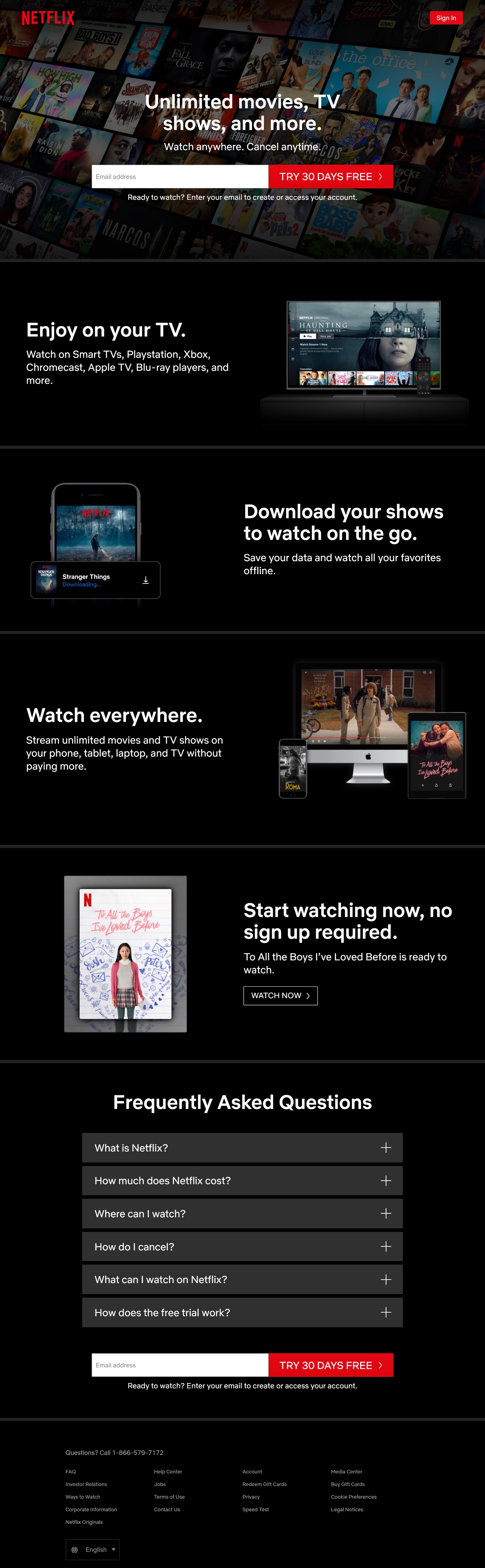
Image Source: Netflix
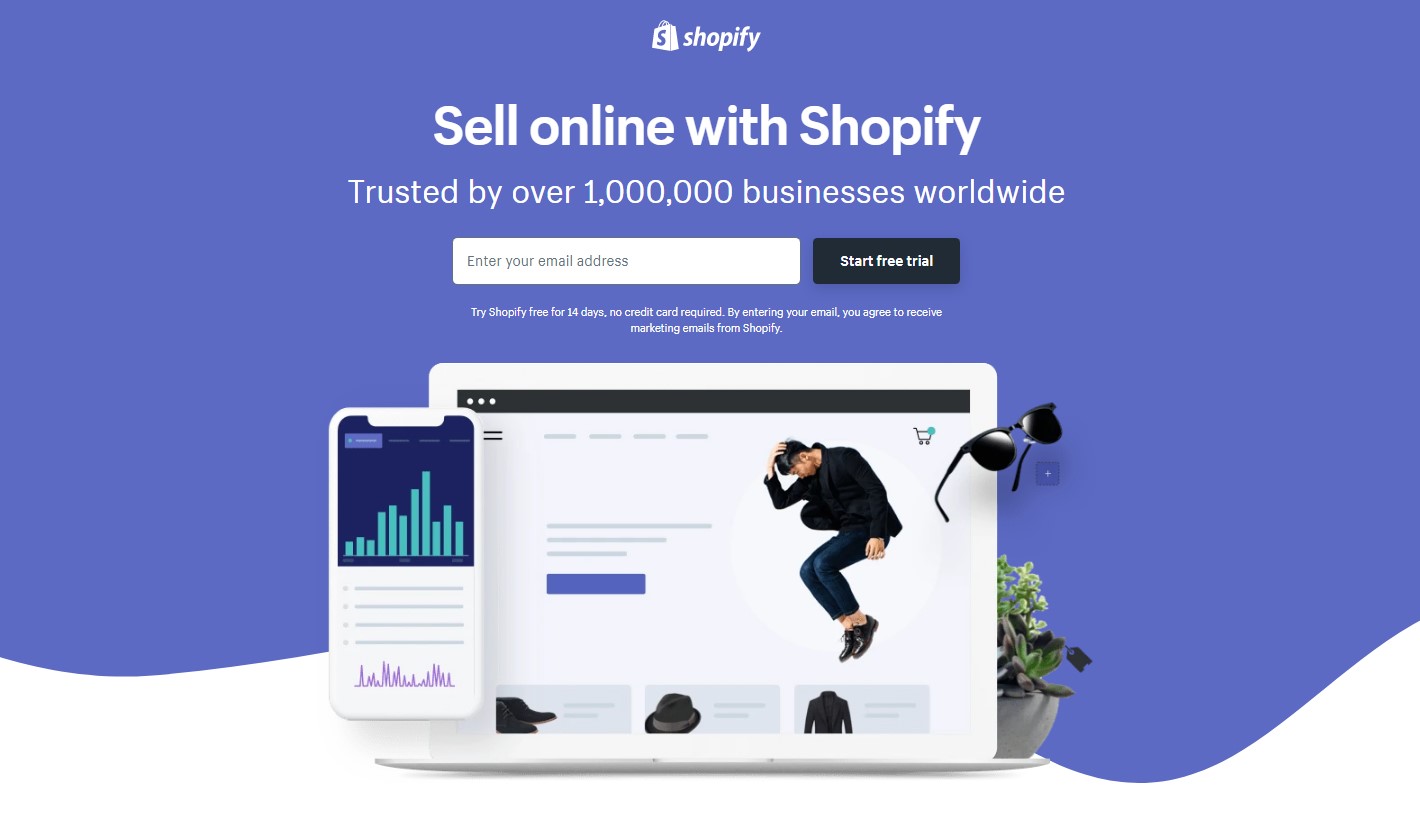
Shopify’s CTA on both their webpage and also on their Facebook ads are enticingly simple, targeting their niche right away with straightforward copyright. As you click on their webpage, a pop-up appears that lets you choose between Shopify for starters and ShopifyPlus for business owners. When you click the CTA button “Start Free Trial,” you are directed to a lead generation type of landing page that encourages you to leave your email address if you want to avail of the trial. Shopify powers over 1,000,000 businesses worldwide, contributing $183 billion in economic activity worldwide
4. About Us” Page
Consumers, on whatever platform, behave on a trust basis. Trust is a good foundation for any business, whether online or not. A link to your company’s story strengthens that trust as your readers learns more about you and why you do what you do. Consumers respond more forcefully with bands they can relate to, and personal stories add an endearing element to your webpage. Trends in advertising nowadays utilise personal stories to appeal more to the consumers’ emotions. If you can touch their heart, they’ll open their hand to you by making a purchase or maybe subscribing to your content or services. So, make your “About Us” page short, simple, and cleverly-written that will keep visitors encouraged to hear more.
Refinery29’s About Page breaks the mold with its striking images, simple layout, and straightforward verbiage broken down into bite-sized nuggets of information about the company since people often are not willing to read a wall full of text explaining who you are and what you do. They also included links to featured pages or blogs on their website and ends the page with their contact information at the end.
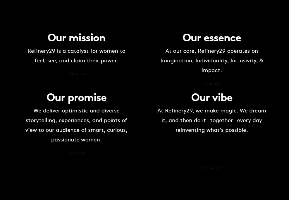
Image Source: Refinery29
5. Contacts Page
You can potentially lose interested visitors and clients just because they could not find your contact page. Since readers decide for about 10 seconds if they’ll leave a page or not, make sure important information about you is readily available to a visitor. They may bookmark your site for later reference if they are in a hurry. But they will not waste their time lingering on your website or even coming back if they do not find what they need. It could be at the top left or right corners of a homepage where it’s easy to see, or in the footer or sidebar on the other pages. Include details like phone number, mobile phone, toll-free hotlines, email addresses, and a contact form, and your complete address including a map locator. Providing your customers and visitors several ways to reach you builds credibility and trust. It’s also best that you research current trends to making fantastic contact pages that work to help you maximise the conversion power of this webpage element.
6. SEO-Friendly, High-Quality Content that Adds Value to Consumers
Great-looking websites with meaningful, trust-worthy, useful content are not that easy to find. You’d typically have to skim through those that may look good on the outside but lack substance within.
High-quality content is meaningful, trustworthy, and useful, hence adding significant value to the lives of their consumers. Some websites make the mistake of driving their solutions to their consumers as if they were hard-selling. Instead, website owners need to ask the very questions their target audience is asking, so they can provide solutions in their website that responds to the needs of their target niche. Once the readers see, there is value in the website—meaning they find answers to their queries on search engines—they will not just linger on the site, but most probably convert to loyal supporters and costumers, which is music to every digital marketer’s ears. SERP rankings include conversion rates and bounce rates (the rate at which a reader lingers on a site). Digital marketers want to see conversion rates up and bounce rates low, not the other way around.
Matthew MacDonald says that “the Web constantly changes. Today’s Web isn’t the same as last year’s—or even the Web of 15 seconds ago. The best websites are always improving. When a website stops changing, it’s on life support.”
For the same reason, content creators and web developers need to produce relevant content that answers consumer demands. If it is not required, how can content be relevant? Keep your website fresh with regularly updated articles. MacDonald compares stagnant sites with television re-run channels that hardly get viewers or advertisers. Avoid that by stay current. Avoid dated content if you can, or make sure to update facts on the article to keep it current periodically. You can add value to your site and maximise its potential by producing content about topics your target niche likes, or show solutions to existing problems they are facing.
Grammarly, for example, is a popular AI-powered writing assistant used for its grammar correction and plagiarism checker services. Its homepage is user-friendly and user-intuitive with simple, bold design, readable text, and compelling CTA. They also provide several blogs to help users become better, more responsible writers. Adding the blog increased the value they bring to their users exponentially, now amounting to 6.9 million daily active users.
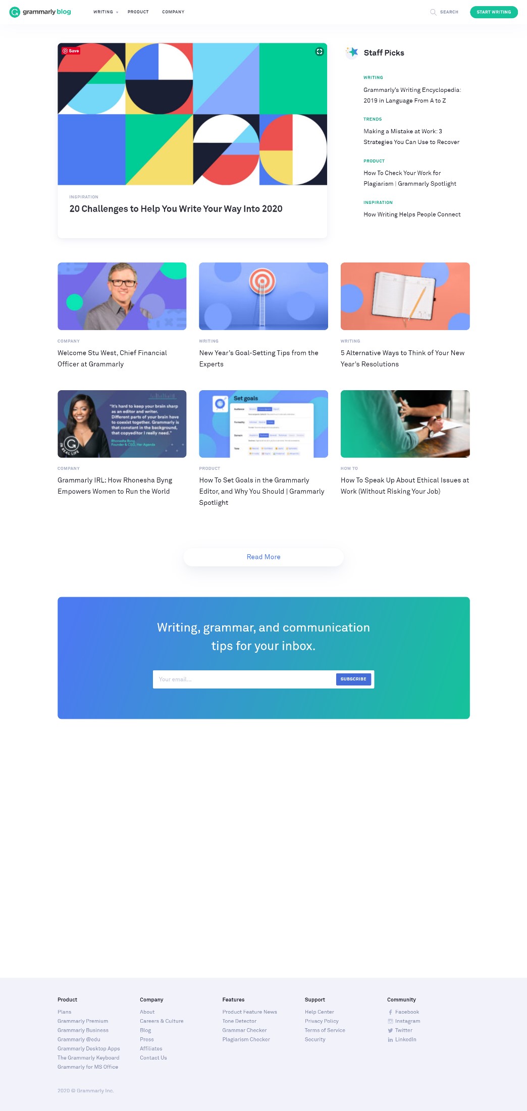
Image Source: Grammarly
Digital Mash, a digital portfolio, has vividly bold images and videos on its webpage that can hook any visitor who enters its space.
7. Social Proof and Testimonials
Image Source: DevRix
Social proofs like users' comments, pictures, and testimonials, along with peer reviews from other reliable brands in your market, help build consumer trust and brand credibility. Even global brands frequently update their testimonials to maintain credibility among the community. When visitors see what other customers and industry peers say about you, it makes them feel more
w confident doing business or supporting you.
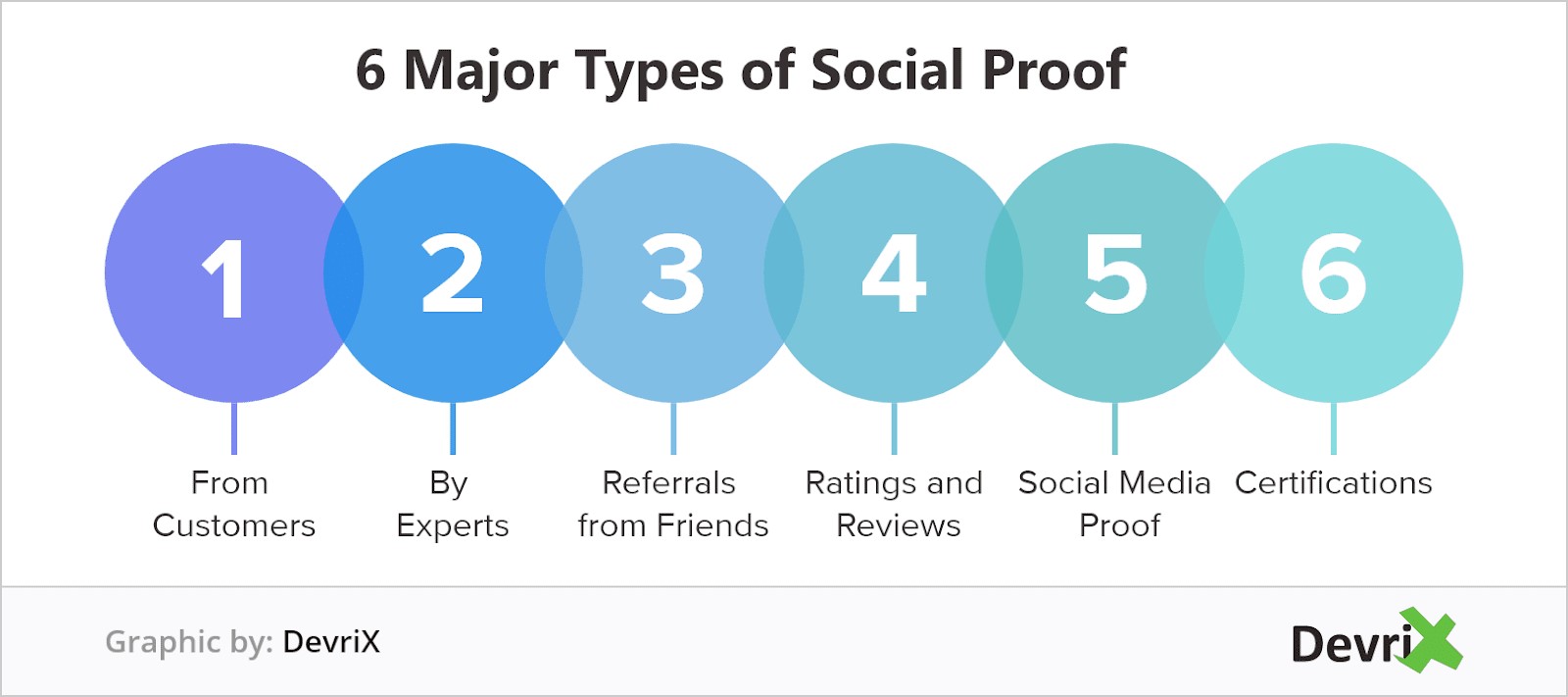
Image Source: DevRix
Include the logos of your prominent clients, industry partners, security seals, certifications, and other relevant proof, even how many people follow you.
Include your social sharing on your webpages, so it’s convenient for your visitors to share your content on various social media platforms. Speaking of social media, have one or two that hit your target demographic efficiently, so you need not invest so much time on maintaining so many accounts. For example, if women are your target market, it’s best to focus on Facebook and Instagram, where the majority of female users hang. Be as visible as you can, so it’s easier for potential visitors and clients to find you.
8. Mobile-Friendly and Mobile-Responsive
Among other factors that Google algorithms use to indicate SERP ranking, mobile-friendliness of websites are now included. Your website needs to be responsive to different mobile devices so it can adapt the content to resize and suit different screen sizes without any distortion. In 2018, 52.2% of web internet traffic happened on mobile devices such as smartphones or tablets. Non-responsive websites will miss reaching more than half of the internet world of users. Having a responsive web design is something that web developers must prioritise at the onset of website creation
Oxford’s printed dictionary, the Oxford Advanced Learner’s Dictionary, has over 100 million users worldwide. They have an online version of their dictionary, like the Oxford Learner’s Dictionary, so that their users can avail of their services online. Since their demographic is vast, from young to old, students and professionals alike, having a responsive website is an optimal choice so that they continue to capture the ones in their market who are on-the-go, mobile users. Check out the images below meant for their iPad and iPhone X users.
9. Secure Hosting Platform
Cybersecurity threats like data breach or malware attacks could cost website owners sensitive data, money, and, worse, customers. You need to be a trustworthy and secure website, so it’s imperative to use reliable web-hosting companies with excellent content management systems. Examples are Blue Host, and GoDaddy are popular, go-to, web hosts for small business owners building their company websites. Get yourself protected from cyberattacks with software that offers total protection against cyberattacks. If you are not protected, you are compromising every visitor that comes to your site, and that is one lousy publicity that is never beneficial for any business going digital.
Image Source: codeinwp
10. Marketing Strategies with Metrics and Reviews
Included your website in your marketing strategy as it’s a channel of your business. There are a lot of digital marketing strategies available you can use to monetise your website, apps, and even social media accounts. There are tools like affiliate marketing, SEO, email marketing, affiliate marketing, SEO, email marketing in-app advertising and purchase, and more. Choose the best one that suits your business and target market.
WhataGraph helps you monitor your website’s performance regularly, so you know if your website is converting onlookers to consumers. It aids website owners and developers with performance metrics to show how your account and campaigns worked and offers templates for data visualisation with automated options for sharing client reports daily, weekly, and monthly.
Conclusion: Go with the Flow of Current Web Design Trends
Web design elements, used strategically, can help tell your story and increase brand awareness. Some current trends in web design the following:
- Unique and large typography
- Large & responsive hero images
- Background videos
- Semi-flat design
- Hamburger menus
- Giant product images
- Card design
- Short product or feature videos
Again, it’s not about following all designs you see out there, but do update your website’s look to match the times, the demographic, or maybe the promo or campaign you are running. Be guided by what would appeal best to your consumers, because at the end of the day, they are the object of every web decision you are making.
Posted by John Ocampos

Related Posts

A business website plays a critical role in how customers discover, evaluate, and interact with a brand.

In today’s digital age, a school’s website is often the first point of contact for prospective parents, staff, and the wider community.

In today’s digital world, businesses face a tough choice: tailored solutions or ready-made templates?
In the world of JavaScript programming, asynchronous operations are a fundamental concept that every developer should grasp. Asynchronous programming allows your code to perform time-consuming tasks, such as making HTTP requests or reading files, without blocking the execution of the rest of your...

WordPress is the backbone of over 40% of websites on the internet, making it the most popular content management system (CMS) globally.

A web app development has been ruling the world for a very long time. Customers are eager to invest in web app development as Paws has made things easier for the users.


Comments
comments powered by Disqus