
Mobile And Responsive Web Design Pattern Tips For Rich User Experience
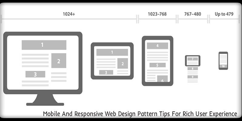
Responsive web design (RWD) has set new standards in web designing. The expansion of advanced technology and mobile devices are pushing developers to accept the challenge and create excellent design solutions.
Responsive web design is becoming a preferred method for creating designs, designing for multiple devices is a crucial task. It requires effort, clear information, and effective layout design. Mobile devices have rapidly revolutionized due to which responsive web design has become usual phenomena instead of a trend now. There are several tips and trends that can help you with your design and make it more efficient.
According to most of the latest market insights and industry analysts’ opinions, responsive web design layouts have now become an essential need for almost every next online business that considers the medium of internet as the primary source for accessing target audiences. Let us now go through a few but highly important tips for enriching the overall user experience.
Ease of use
While using mobile phones, users get impatient and tend to get confused by messy, cluttered websites or designs that have poor experience making it unfavorable for the users. Designers and developers need to keep this in mind that navigation is the key. Users are looking for ease of use to gain favorable experience. In addition to that, there are several newer ideas as well such as featuring easy navigation which further eases the process of website exploration for the end users.
Regular vs Responsive experience
There’s a huge difference between regular browsing experience and mobile experience. Websites designed for mobile devices should have to the point information and not contain unimportant information. A great mobile experience should not give you the exact website you would normally research and should include graphics. Effective methods of data entry, graphics and animations must be provided to mobile users.
Google Analytics and apply data
Google analytics help us determine the value of our product on mobile phone or desktop. It shows how the product is being used on every platform. With the handy tools like Google analytics website usability can be checked, it allows a better way to understand your users and acting using data. Applying data makes it easier to create a smooth experience and more likely satisfies the user needs.
Fitting the need of the audience
It’s not necessary to work with data, but it can serve as a help allowing you to be very specific when considering the need of your audience and create a perfect experience for the users. There are several ways to target the audience when we target audience we don’t target in general as each niche has its own requirements and needs.
Responsive patterns
The responsive websites use the grid system when designing their layout. Due to the nature, responsive websites are built on grid system or a pattern resembling content on a canvas. They differ from one website to another because particular needs have to be considered when deciding to use or not. The patterns are layout shifter, column drop and off canvas.
Responsive Website Builders
There are certain tools that website builders can use to convert Photoshop design for responsive web templates. Begin with responsive design and create high fidelity prototypes and CSS layout by using one of the tool.
Webflow- top drag and drop website
Adobe reflow- create responsive design by creating high fidelity prototypes
Macaw- provides flexibility as your image editor with HTML and CSS
Posted by Cruz Petar
Related Posts

A business website plays a critical role in how customers discover, evaluate, and interact with a brand.
In the world of JavaScript programming, asynchronous operations are a fundamental concept that every developer should grasp. Asynchronous programming allows your code to perform time-consuming tasks, such as making HTTP requests or reading files, without blocking the execution of the rest of your...

WordPress is the backbone of over 40% of websites on the internet, making it the most popular content management system (CMS) globally.

A web app development has been ruling the world for a very long time. Customers are eager to invest in web app development as Paws has made things easier for the users.

As the world of eCommerce continues to evolve, businesses are constantly seeking ways to stand out in the digital landscape. According to a report by Statista, it is predicted that global online sales will reach an impressive mark of $6.5 billion by 2023.

For startups in 2024, there are few aspects as important as web development.


Comments
comments powered by Disqus