
Maximizing Micro-interactions: The Key to Improving Your UX Design

You most likely have dedicated a lot of time and money into your website, making sure its user experience (UX) is in optimum condition.
After having all the online business basics nailed like better product photos or authoritative content on your blog, something in your gut tells you it can get better. The key here lies in the smallest of details. As present-day customers wake and sleep connected to the Internet, spending up to almost 1/4 of their day online, they are trained to browse quickly and have become capricious in their surfing. But it is the minute details in your website that will make the difference between a customer that converts and a customer that leaves. What does your website offer in terms of accessibility, entertainment, differentiation, and speed? Having quality micro-interactions can keep those busy and impatient users engaged in your website—and more importantly, get converted into loyal customers.
Micro-Interactions: The Basics
In simple terms, digital micro-interactions happen when users interact with websites.
These micro-interactions serve as the guide for users while they browse, giving them a “humane” feel as they navigate through the website.
For instance, almost every time your cursor hovers over a link on a website, the arrow transforms into a pointing finger. This is a micro-interaction that affirms your thought that a word or phrase is clickable.
Whether you click to write and send an email, or when you login and a loading icon appears on the screen, these are all considered micro-interactions.
Why Do We Need Micro-Interactions And Where Do They Fit?
We should never underestimate the power of micro-interactions, as it can be the differentiator between a high bounce rate or a high conversion rate. If you don’t regularly keep track of these metrics yet, this low down on ecommerce analytics is for you.
Aside from giving our visitors a smoother navigation experience, thereby increasing the chances their visit will convert into sales and that they will return, micro-interactions give you the opportunity to make your visitors feel that you are paying attention to them and their needs in real time. They can guide them to where they want to go, where you placed the information they seek, or where you placed the products they didn’t know they wanted.
Micro-interactions also help enhance your customer service. We all know how it feels to receive bad customer service. But if we are treated well, especially if we are given what we need before we even realize it, we are likely to return and/or recommend.
The Anatomy of Micro-interactions and How They Work
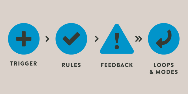
A micro-interaction is made up of four basic parts. Just like the human body, all these parts need to be in good shape for good performance; otherwise, issues will arise.
- The trigger: This is the first part that sets off the interaction. Whenever a user or system begins the interaction, the trigger is pulled. For system triggers, users must meet certain requirements for the micro-interaction to be triggered. A system trigger can be as simple as opening a website. Another type of trigger can be clicking the send button in your email.
- The rules: This is the second part, and it dictates what will occur after the micro-interaction has been triggered. The rule for a trigger that happens after you open a website may be for the website to fully load. In your inbox, the rule will be clicking the ‘send’ button to lead into the transmission of the email. This part should only be seen or known to the designer and almost be unnoticeable to users.
- The feedback: This is the third component, and it gives the user a notification of what happened. Feedback can be a sound, sign, or feel (in mobile devices). This will let the user know that they have started a micro-interaction. Once you open the website, a loading bar will appear notifying you that the page is in the process of loading. In the email scenario, the ‘send’ button will or won’t change its color to convey to you if the email has been sent or not.
- The loops and modes: The final and equally important part sets the meta-rules of what will happen when conditions and/or requirements are altered. Loops dictate how long and how often the micro-interaction will happen—how long will the loading bar move until the page fully loads? Modes also rule what happens over a determined time period—for example, email sent during an interrupted internet connection will be put in the outbox or draft folders.
Making the Most of Micro-Interactions
Knowing how and when to use micro-interactions is critical. Use them too much and you will saturate your UX design and annoy your visitors. Use them too little and your website will be dull, with visitors not even bothering to wait for the page to load.
Your micro-interactions should complement a well-thought out browsing experience, with a clear design and hierarchy of information present. Here are some instances where we recommend you use them:
- 1. Animation between pages
Nothing says “I care about your time” more than making it fun for people to navigate your website. You’ll have people wanting to go to other pages in your website just to see what can happen. Let your users be kids again. - 2. Animated input field
We all know how tedious inputting information can be. The easier and entertaining you make it, the better. Highlighting, zooming, and nice transitions are a plus. - 3. Upload or download status bar
No one likes these things, unless they are moving fast. Might as well make it interesting for users who are rooting for the bar to reach 100% quickly.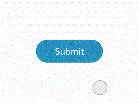
- 4. Notifications
Notifications are annoying but sometimes necessary. Our short attention spans require reminders. A micro-interaction will do the trick of reminding what users were doing before they start looking at that pop-up picture of puppies. - 5. Pull-down menus
Everyone has pull-down menus, because they are essential. Make them interactive and see how people engage. - 6. Call-to-action buttons
These should be called the feel-good button. In this fast-paced world, sometimes all we need is instant satisfaction like successfully completing a transaction with a simple click of ‘submit’, ‘buy’ or ‘subscribe’. - 7. Fun fill-out forms
If users are going to give you their personal information, it’s best that you get their attention and make it worth their time. - 8. Anchor text animations
Do you have a lot of clickable text? Do more than those basic blue underlined words. Stylize with fun effects and you will be sure to catch more attention. - 9. Swipe feature
The less effort with the greatest output will always be preferred. Why click and select when users can just swipe? - 10. Tutorials
With a generation born with smartphones in their cribs and interactive materials from K-12, micro-interactions can save your blog and bring dynamic content to your users—such as this step-by-step guide that illustrates various options for starting a website or this infographic that gives you all the specs you need for platform-appropriate photo sizes. Long gone are the days of manual reading.
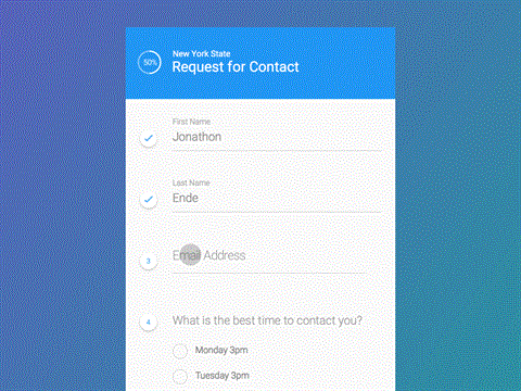
Note that micro-interactions don’t have to be used separately. Take the process of filling-out the online form below.
The status bar on the upper left informs the user of progress, as the numbered questions transform into checks after input completion. The font color also changes while typing in the text box, which allows for the user to better concentrate. A proper and careful selection of a couple can enhance the user experience by providing feedback and visual satisfaction.
Takeaway
Enhancing your UX with quality micro-interactions is effective and beneficial for your ecommerce platform. But make sure you already have a strong foundation—a great product and a keen understanding of your customer base.
Giving your visitors the best customer experience via micro-interactions will make it easy for them to return the favor with more purchases and quality references. Also, keep in mind that not all users have the same level of accessibility. Take things up a notch and consider optimizing your site for visitors with disabilities.
What else do you need to improve in your site, in terms of micro-interactions? Let us know in the comments below.
Posted by Naida Alabata
Related Posts

A business website plays a critical role in how customers discover, evaluate, and interact with a brand.

In today’s digital age, a school’s website is often the first point of contact for prospective parents, staff, and the wider community.

In today’s digital world, businesses face a tough choice: tailored solutions or ready-made templates?
In the world of JavaScript programming, asynchronous operations are a fundamental concept that every developer should grasp. Asynchronous programming allows your code to perform time-consuming tasks, such as making HTTP requests or reading files, without blocking the execution of the rest of your...

WordPress is the backbone of over 40% of websites on the internet, making it the most popular content management system (CMS) globally.

A web app development has been ruling the world for a very long time. Customers are eager to invest in web app development as Paws has made things easier for the users.


Comments
comments powered by Disqus