
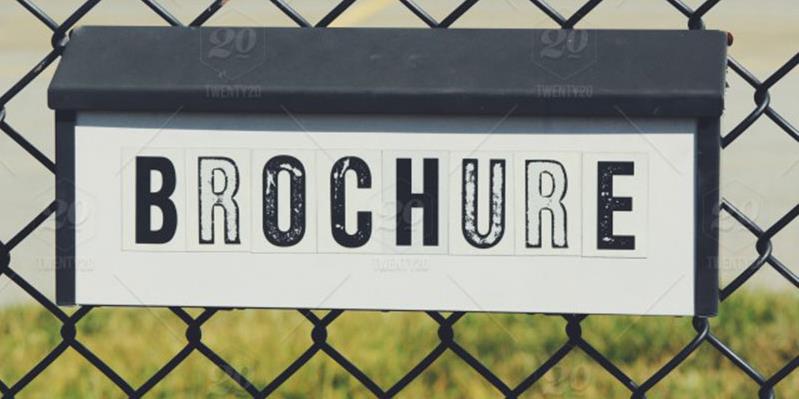
9 Deadly Mistakes That Will Make Your Brochure Less Attractive!
Recall the events when you went to some exhibition….. And people handed over brochures to you.
Some brochures were stunning that you didn’t put your hands off them.
Your brain doesn’t let you forget the things quickly. You must be wondering, still the memories are there in your mind and it feels like that event happened yesterday, right?
That’s why we say that brochure is the most amazing marketing tool. An appealing brochure is always hard to ignore. The world is on your fingertips now; you search everything online. Well, whatever it is, still brochures didn’t lose its charm, they still fall on the hot-seat of marketing.
Please be all ears before proceeding with the complete post, as here; we are going to tell you the mistakes you do while designing a brochure and getting it printed.
1. Making assumptions that your designer knows telepathy
Maybe you are good at telepathy, but your designer is not. Oh please, don’t make this silly mistake as your designer can’t read your mind. Fill in the cracks and communicate to your designer what your business needs are, what theme you are looking for in a brochure. Let him know the personality of your brand, if you have the samples of previous marketing materials with you, provide him with that.
Explain to the designer about your target audience, explain the services or product you offer. After telling him all these things, you can expect to get a perfect brochure from him.
2. Flooding brochure with countless pictures
BRAVO! You perceived it right, people are interested in seeing visuals but wait! They don’t expect you to flood your brochure with images. Undeniably, it is easy to grab your consumer’s attention via brochure but yes don’t clutter it. You don’t have to include too many images. Brochures are the perfect marketing tool if you use them wisely. Pictures have a great impact on our minds. You want to stay ahead of the competition, right? For this, get a clutter-free brochure that helps you in retaining the interest of customers.
3. Don’t include an excess of information
Listen, mortal; you aim to grab the attention not to send the customers away. Your brochure represents the services or products you offer. It tells the features of your services and products. If you are going to fill your brochure with too much text, people will dump it then and there. Even if the requirement compels you to add excess text then break it in the form of headings, have bullet points in the brochure so that it doesn’t look cluttered.
4. The absence of logical flow in the brochure
Some brochures lack the logical flow. Think of your brochure as a systematic arrangement of events in which every step links to another one. Information has to be in a good flow in the brochure. First of all, create an outline of your ideas, create a subtle plot, it will help you in perfectly organizing the information.
5. Poor Quality of paper
Don’t kill the very essence of your brochure by choosing the worst quality paper. There is no sanity in saving your money and choosing the worst quality paper stock. You have to use the best paper if you want to give a perfect image of your company.
6. Choosing the mismatched designs
Don’t rush, after all, it’s the matter of your company’s image. Don’t ever go for a brochure that doesn’t resonate with your business personality. Your brochure has to be designed while keeping the target audience into your mind. Before finalizing any brochure, review it thoroughly and see if it goes well with the company’s image. If you think it doesn’t gel well with the company’s image, just do the needed amendments.
7. Not hiring the services of a professional
Don’t make a blunder of hiring the services of an amateur. Spending more bucks will not do any harm to you. People who offer you brochures for $5 do nothing other than taking an already built template and inserting the text inside. Amateurs only trick your mind by showing you the golden offering of $5, while they only deliver an unpleasant piece that dulls the beauty of your content.
8. No aesthetics sense
Don’t run in the lane of those who don’t care for this marketing tool. If you want to give a professional image of your business, don’t make a mistake of ignoring your brochure. The elements that are there in the brochure have to be aesthetically sound. Be it typeface, font size, the structure of information, everything has to be there in the right balance. To bring harmony to the design, always go for the services of a professional as he knows how to make you stand out from the rest.
9. Wrong selection of colors
You are not inviting others to a fancy dress competition so please don’t throw the colors on your brochure. Alright, we do understand that you want to make it visually appealing, but it doesn’t mean that you build a pyramid of colors. Choose those colors that look complements the brochure. Have a good contrast between the font color and the background color else your brochure won’t look good.
Choosing colors randomly don’t make any sense. Stick to your corporate colors if you have any because it will bring consistency. If the product or services demands to go for a separate color theme then don’t hesitate, do it.
Bottom line
Brochures are the essential part of marketing. You just can’t deny the fact that they promote your brand silently. Who doesn’t want to give a professional image of the company? Everyone does. For this, you have to put in extra efforts by taking minute details into count.
Posted by Victoria Ashley
Related Posts

Staffing shortages are squeezing hotels on both sides of the Atlantic.

In today’s digital age, a school’s website is often the first point of contact for prospective parents, staff, and the wider community.

One thing you don't want to do is have a LinkedIn post that sounds either too stiff or too casual.

Modern marketing professionals are turning to sophisticated tools to streamline their networking efforts and expand their reach on professional platforms.

In the ever-evolving landscape of digital marketing, paid advertising has become the cornerstone of success for businesses aiming to capture the attention of their target audiences.

In today’s digital world, businesses face a tough choice: tailored solutions or ready-made templates?


Comments
comments powered by Disqus