
6 Common UX Problems and How To Fix Them

We’ve all, at some point of our life, obsessed over that “pretty” design we wish we could create. A brilliant theme with fantastic, state-of-the-art animations and, perhaps, even a new technique that can’t be found elsewhere.
These beautiful websites may have aced the “design” category, but are not necessarily the best in terms of functionality and providing a great user experience.
Remember, this is the age of “mobile” people with mobile devices. In a situation where immediate feedback or response time is of greater concern, a “pretty design” lacks relevance. This doesn’t mean that you overlook the aesthetics either. The best websites aim to balance design, functionality, and purpose. However, one aspect that simply can’t be overlooked is user experience.
User experience has a great bearing on conversion rates—and we all know why those are important. This is exactly why the study of UX (User Experience) has been brought into the design field for better results. Unfortunately, many designers are still overlooking common UX mistakes which damage a websites potential to convert visitors because they provide a negative user experience. Here are six of them:
Arduous Forms:
Form filling is a nuisance. First of all, users shouldn’t have to fill forms to accomplish simple tasks such as commenting on or liking a post. Providing an option to sign in with a social networking account is far more convenient (especially if the option is to skip account creation, not link it to the website’s new account).
Form filling is, however, necessary for subscriptions, purchasing, and other services. In that case, form filling shouldn’t be the most cumbersome tasks the users have come across. Extensive, confusing, or heavy forms are often avoided by users—and should be avoided by designers too.
The Simple Fix: Make forms easy to fill with only the necessary fields highlighted. Organize it intuitively so users may know the requirements. Avoid complex requirements or confusing language. Provide error messages and hints on how to correct mistakes.

Did you know that Hubspot increased their form completion rate by 50% just by reducing four fields in the form?
Ignoring Mobile User Objectives:
What does a mobile user want? These users are the ones you want to watch out for the most, because their “experience” requirements are usually higher than those of desktop users. When it comes to designing website for mobile devices, we have to put extra efforts in ensuring optimum usability and UX. Mobile users could be sitting on a bus, in a meeting, or walking on their way to work. They require immediate gratification, and being responsive is definitely one way to fix it. But guess what? That’s not all. The mistake here is that some designers tend to label all of mobile user’s problems under one category: responsive. But what about the user’s objective? Perhaps he needs to book a hotel room, and although the website is pretty quick, it does not have the booking form on homepage.
The Simple Fix: Never overlook responsive, but aim to go one step further by figuring out what a typical user wants out of your website. Which tasks does he want to accomplish? How long does it take to accomplish those tasks? Where could they possibly lose track, get distracted, or get stuck? Try to quickly deliver what users want.

Apartment Guide is a not only responsive, but also quite purposeful by providing the apartment search box right on banner area of homepage.
No Completions Meters:
Users like to know how far they are getting with their goal. This is especially true when profile building, form filling, or online purchasing is involved. Whatever “process” you have on your websites, it always helps to provide users with a visual representation of what they’ve already accomplished and how much is still left.
The Simple Fix: Provide “strength meters” or completion percentages that not only give a clear idea of where they are at, but also engage users due to the psychological benefit of “getting a high score”.
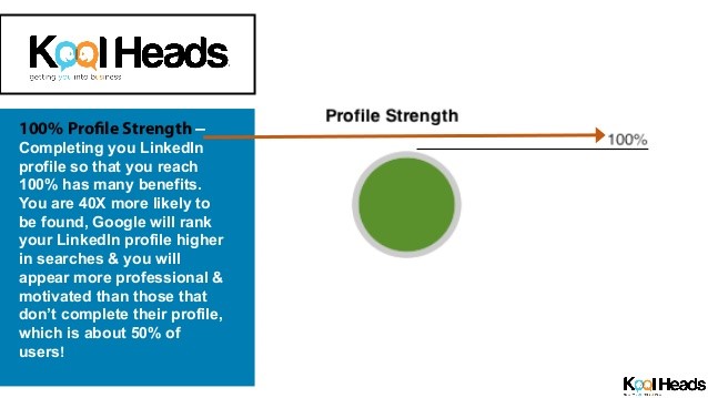
LinkedIn’s profile strength meter is a perfect example that slowly fills up along with the form and gives users a clear idea of what they need to do next.
No Search Bar:
You may think otherwise, but a search box is a necessary part of a web design. You can’t expect users to immediately pinpoint what they are looking for on your website. But with a search bar included, the possibility of them finding it is greatly increased. For websites with extensive information, this is a crucial element. Whichever the case, today’s search-box prone online users would appreciate a box at the top that would save them an enormous amount of time that they would otherwise spend if they are forced to perform manual searches.
The Simple Fix: If creating a custom search box is not possible for you, then you may install a search engine script.
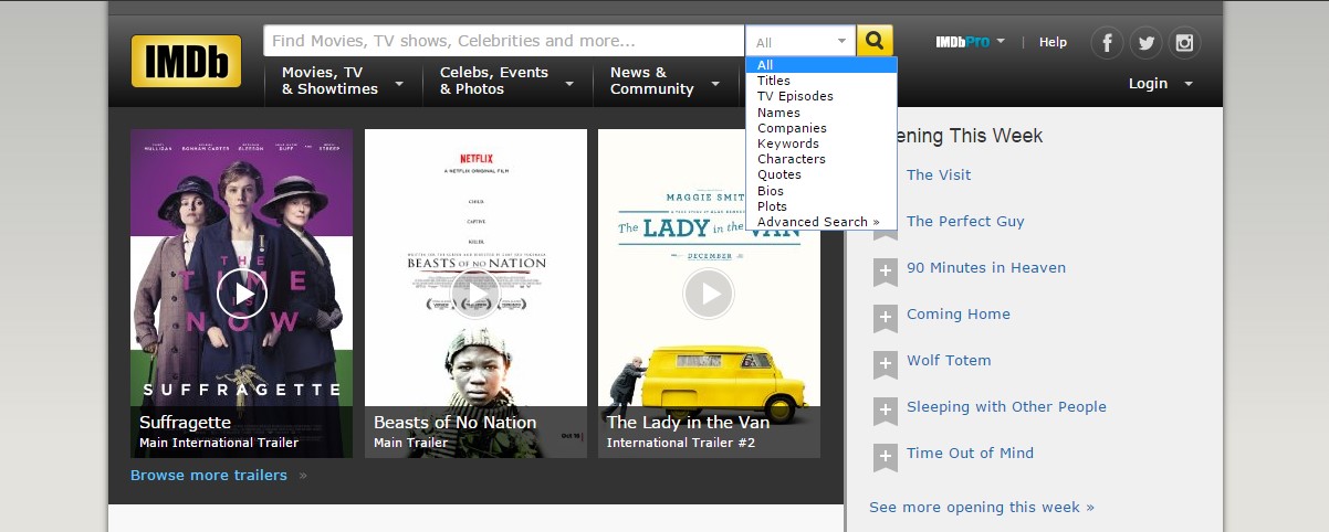
What would IMDb be without a search bar?
Focusing on Features and Not the Benefits:
Your super product may have super features. But what good does that do to your users? This is what many small business websites forget to mention. If your landing pages are loaded with “features” that are quite impressive, instead of focusing on what you users are looking for, you’re clearly focused on your products. Clearly, this is another usability flaw because you’re potential customers probably can’t figure out how to “use” your services in a way that benefits them at all.
The Simple Fix: Instead of listing down features, identify how these “features” will contribute to a user’s end goal. Keep the language simple and conversational.
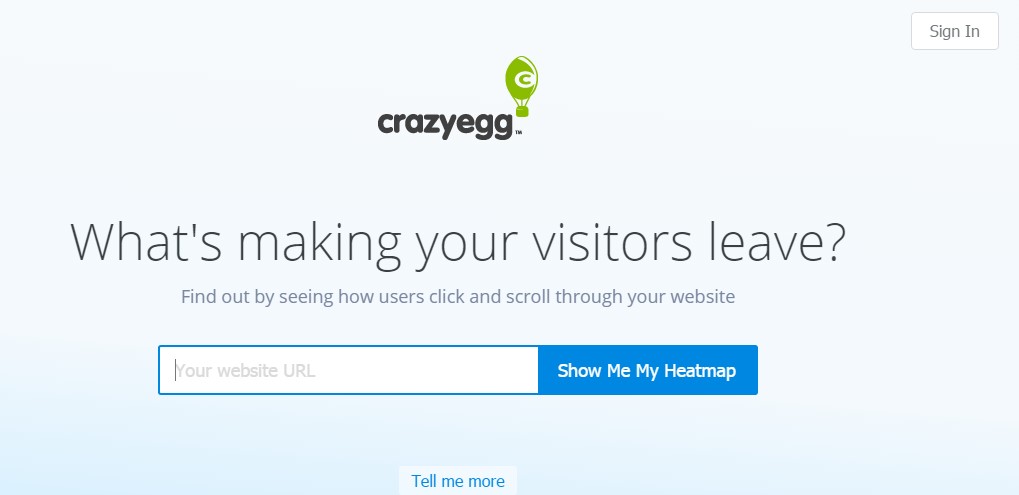
Instead of saying something like “check your web analytics”, Crazy Egg presents a user-focused problem and solution: “What’s making your visitors leave?”
No Feedback:
Apart from using various statistical tools to find out what’s working and what isn’t, it is crucial to obtain feedback from users. Ensuring usability and fabulous user experience is an ongoing process. You won’t always be able to figure out and fix the “bugs” without a little bit of feedback.
The simple fix: Along with usability tests, don’t forget to ask users to pitch in with questions, comments, or surveys.
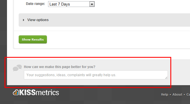
The Kissmetrics feedback box doesn’t seem intimidating at all. In fact, it’s quite welcoming!
The Take Away:
A user-focused design process is actually good news for designers. Instead of making development all about visual artistry and how “unique” your page can be, you are simply required to put user problem-solving front and center.
Posted by Usman Anwar

Usman Anwar is a UI designer and blogger at Logo Gulf, a Logo Design Dubai Company. He is a marketing graduate with certification in designing and front-end. He blogs at Logo Gulf's official blog and various other design and marketing blogs.
Related Posts
A business website plays a critical role in how customers discover, evaluate, and interact with a brand.
In the world of JavaScript programming, asynchronous operations are a fundamental concept that every developer should grasp. Asynchronous programming allows your code to perform time-consuming tasks, such as making HTTP requests or reading files, without blocking the execution of the rest of your...

WordPress is the backbone of over 40% of websites on the internet, making it the most popular content management system (CMS) globally.

A web app development has been ruling the world for a very long time. Customers are eager to invest in web app development as Paws has made things easier for the users.

As the world of eCommerce continues to evolve, businesses are constantly seeking ways to stand out in the digital landscape. According to a report by Statista, it is predicted that global online sales will reach an impressive mark of $6.5 billion by 2023.

For startups in 2024, there are few aspects as important as web development.


Comments
comments powered by Disqus