
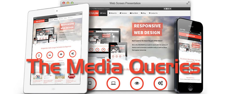
The core of any Responsive Web Design framework is the media query. Media queries are what enable your website to call different style declarations from your stylesheets based on the current window width of the viewing device.
Read More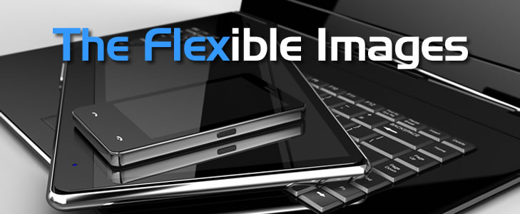
The flexible images are responsive web design’s second pillar. They allows us to provide image solutions with no restrictions to a fixed display size.
Read More
Part of any good web design in these modern times is the fluid grids. Our canvas, the browser window, can bend and flex to any shape or size, whether changed at the whim of the reader, or fixed by the phone or tablet they’re using to view our content. This practice will accommodate a variety of browsers already that demand the design be flexible and fluid.
Read More
If you bill your clients by the hour, than providing accurate, detailed invoices should be considered a critical part of your customer service strategy; and is essential for the long-term success of your business.
Read More