
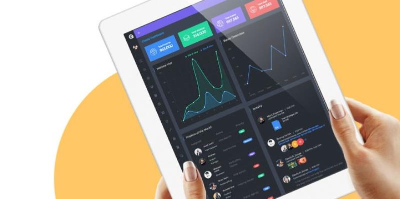
Top 5 Key Principles for Setting up an HR Dashboard
Until recently, when you went into the back end of any enterprise application, HR included, there was little variation in design.
The admin panel was set up purely as a way to access information with little attention paid to aesthetics or even user experience.
Today, thanks largely to the creation of easy-to-use front-end design frameworks, developers put as much effort in dashboard design as they do in designing consumer app interfaces.
If you are designing an application from scratch, this article is a must-read as it focuses on five fundamental principles of dashboard design you should include in the development. This article will also help admins to set up a pre-existing HR dashboard so that the most important information is to hand.
Research before you build
It is important to take a whole department approach when designing an HR dashboard. It is a good idea to get as many people as possible involved in the research project. The ultimate goal is to build a dashboard which is suitable for every employee who needs to access it. This is not always easy. Although there will have to be some compromises, the needs of those people who access the dashboard most often should probably be given more weight.
For example, an employee in charge of staff recruitment might want to see the yield ratio at every stage of the recruitment process on the default dashboard. This may not be practical if other staff need to see headline figures regarding revenue, profit, turnover, absenteeism and other aspects of HR. A compromise might be to show the 'cv to hiring manager' yield ratio on the default dashboard and include the full yield ratio stats on a separate tab or page.
Every HR department is different in terms of the average age of employees, type of industry and team culture. An HR dashboard in a small town library is going to look and feel very different to one in a Silicon Valley tech company.
Declutter your dash
The golden rule with dashboard design is simplicity. Every element on a dashboard needs to earn its right to be there otherwise it's just clutter. Extra elements, especially those containing large images and animations, can also slow down page load time. This can be very frustrating when you have to access the dashboard multiple times a day.
A useful exercise is to mock up a dashboard layout on a whiteboard and get various members of the team to place post-it notes as either dashboard items (graphs, cards, widgets, etc.) or sidebar links. Instruct them to prioritize the information they need to see and to move everything else across to the sidebar as a link.
For HR dashboards, it can be useful to divide the display into separate areas. For example, one quadrant could display overall revenue and profit metrics, another could look at opex costs (training cost per employee, etc.), a third could focus on sickness rates and absenteeism while another could look at recruitment and attrition metrics (time to hire, source of candidates, etc.)
Further details for each segment could then be found on separate tabs or pages. For example, an employee in charge of sickness monitoring could access headline sickness rate on the main dashboard but would need to select a tab or page to find more specific metrics (e.g. sickness rate per department or per manager).
Challenge every decision so that you end up with the simplest dashboard design possible. If you are developing an application from the ground up, this can then form the precursor to a wireframe design.
Choose the right mood
Mood may seem to have little to do with a well-designed administration dashboard but everything from the choice of background color to which elements are on the front page can have a subtle effect on team morale.
For example, if the background design is dull and uninspiring and the metrics displayed focus on what has not been achieved, this is likely to have a demoralizing effect, especially if staff are accessing the dashboard multiple times a day.
Contrast this with a dashboard featuring a soft, warm background and at least some evidence of achieved objectives and the mood of the team is likely to be more positive.
Even the type of chart you choose to use can have an influence on employee psychology. For example, tasks with specific targets (e.g. the number of appraisals completed) are often best displayed as a donut chart since this gives a visual representation of how close the team are to meeting their objectives.
Try to balance the need to keep key information top of mind with the need to keep the team motivated.
Who are you speaking to?
A modern dashboard can look amazing with stylish layouts, attractive color schemes and eye-catching animations. However, at its heart, it is a communication tool and will succeed or fail based on whether its users understand what is being shown to them.
A good rule of thumb is to use plain, jargon-free language where possible. The exception is where HR-specific terms are so widely understood that they will save space without confusing the user. For example, it is probably fine to use the abbreviation FTE rather than having to squeeze in 'full-time employee' on your graphs and tables.
If you are building a new dashboard, you should spend some time deciding on which icon set you want to use or whether you want to invest in creating a bespoke set. There are many different sets to choose from ranging from simple line icons and material design-inspired sets to customized sets for HR departments!
Gather feedback
If you are going through a dashboard design process, you should always get feedback from the end user before committing to development. The best way to test a dashboard is to create a basic demo, sit down with individual team members and ask them to walk and talk you through their experience. Ask them what they like and dislike about the dashboard design as well as what they found easy to accomplish and what they found difficult.
By carrying out detailed research on the dashboard users, simplifying the layout as much as possible, designing in a subtle psychological lift, communicating clearly with labels and icons and getting plenty of feedback from the end user, your HR admin dashboard should serve you well for many years to come.
Posted by Sunil Joshi

Related Posts
A business website plays a critical role in how customers discover, evaluate, and interact with a brand.

Job hunting still devours your evenings—tweaking résumés, re-entering work history, clicking Apply on repeat.
In today’s digital age, a school’s website is often the first point of contact for prospective parents, staff, and the wider community.

In today’s digital world, businesses face a tough choice: tailored solutions or ready-made templates?

Lost your iPhone? Well, it can be a pretty scary experience, but we promise you that not all hope is lost.

Real-time applications are changing the way we interact with digital platforms, providing instant updates and smooth experiences.


Comments
comments powered by Disqus