
The Pros and Cons of Icons in Web Design
Web design is a deceptively complex affair. To the uninitiated, it may seem as straightforward as “moving dots around on a screen”.
However, this simplistic over-abstraction belies the true nature of the task at hand. If you are in Birmingham and wish to create an effective, compelling web design, then we have some tips for you.
Take the use of icons as an example. In the following article, we will go on a deep-dive into the use of iconography and its application to web design, by looking at some pros and cons of incorporating icons into your nascent web page.
The Pros:
Simplicity
A good icon takes a large, abstract concept and boils it down to a single, easily identifiable shape. “Go to the next page” reduces down to a simple arrow, for example.
The human mind craves simplicity. It seeks to create order out of chaos, even going so far as to manufacture order from random noise, when there is an underlying structure to be found.
As a designer, you want to communicate your message clearly and effectively. If the user gets bogged down in parsing and digesting whole walls of text, that is the time they are not spending in using your site for its intended purpose. Icons, properly utilized. mitigate this problem by facilitating snappy, efficient communication.
![]()
Clarity
A picture is worth a thousand words. This statement, while cliched, is widely applicable across the design world. As with film, there is great wisdom in endeavoring to show, rather than tell. To that end, a simple, snappy image, properly located, can be the saving grace of your whole web page.
Some ideas are difficult or tedious to communicate in mere words but can come across instantaneously with the help of one well-made icon.
In order for this to work, you need to be able to take any task and boil it down to its most simple, core element, to know “what is it, truly?”, and to then devise a method of displaying that truth with a few lines or pictographic elements as possible.
Focus
Icons have a delicate balancing act to execute. They need to draw the eye, and to be instantly recognizable and fully understandable at a glance.
But, be too eye-catching, and they risk drawing the eye away from its intended location on the page.
Used well, they are obvious and yet unobtrusive, allowing the user to engage with your page as intended, with the minimum of extraneous distractions or fuss.
Cons:
Clutter
Small things can be very distracting. A large dog strolling about the room minding its own business often goes ignored, but a tiny mosquito doing the same thing quickly commands the attention of everyone nearby.
This is true of icons as well. Use them sparingly and tactfully, with precision.
You want to avoid their overuse, in having a page that is so full of iconography and imagery that it obscures your message as a whole. Think clarity, think elegance, not only in designing your icons themselves, but in choosing how they interact with the rest of the page.
Lack of Purpose
Before including any design element, it is critical to ask this primary question: “Do I need this?”. If it doesn’t immediately assist you in achieving your goal, don’t include it. If it helps, think of your site as a movie script. You have limited words, limited time, and limited space within which to command your audience’s attention and to communicate your point. Do not squander these valuable resources on unnecessary fluffery and flourishes.
Redundancy
Slavish focus on simplicity is great. Go too far in this direction, however, and you enter the realm of superfluity. If you need to explain what your icon means in words, either in the icon itself, or immediately nearby, then your design has failed. Having to repeat yourself defeats utterly the primary purpose of the icon, which is to keep your site as sleek and distraction-free as possible, while losing none of the core message.
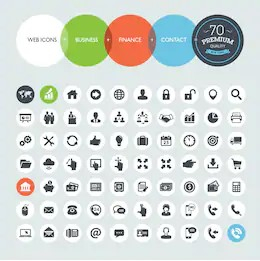
You may have noticed that I have included the same image thrice in the preceding paragraphs, and that is because it ticks all of the bad-design boxes.
It is garish. The distracting color scheme makes the entire page virtually impossible to read without strained effort.
It is cluttered. There are too many icons. Worse, the icons are redundant. Not only do they ugly up the page with their loud border colors, they also make no immediate sense and need to be explained by accompanying hyperlinked text.
It is distracting. The important information, the paragraph of text in the top-center of the page, is almost unnoticeable when contrasted with the overbearing presence of the icons and colored links everywhere. The loud colors serve no purpose. Choose one, and stick with it. Black on yellow, perhaps. Less is more. Subtlety is your friend.
The icons, as shown there, also serve no purpose, since each and every one of them needs to be individually explained.
The travesty you’ve just seen is an example of every bad design concept rolled into one glorious trainwreck of a website. You’d have to put in quite a bit of effort in order to fail harder than that. It’s somewhat impressive, actually.
You’ve seen the principles of good design in action. You’ve seen the horrors that can result from ignoring or misapplying those principles. Go forth now and do likewise. The entire internet is your oyster. Fill it with well-made, beautiful things. Promote your business with clever icons. Entice new customers with a beautiful aesthetic. Grow your brand with compelling iconography.
If you aren’t a programmer yourself, or don’t feel up to the task on your own, and need a hand, there are many web design agencies in your area that would be more than happy to assist you with the design process. Happy creating!
Posted by Sergio Arboledas
Related Posts

A business website plays a critical role in how customers discover, evaluate, and interact with a brand.

In today’s digital age, a school’s website is often the first point of contact for prospective parents, staff, and the wider community.

In today’s digital world, businesses face a tough choice: tailored solutions or ready-made templates?
In the world of JavaScript programming, asynchronous operations are a fundamental concept that every developer should grasp. Asynchronous programming allows your code to perform time-consuming tasks, such as making HTTP requests or reading files, without blocking the execution of the rest of your...

WordPress is the backbone of over 40% of websites on the internet, making it the most popular content management system (CMS) globally.

A web app development has been ruling the world for a very long time. Customers are eager to invest in web app development as Paws has made things easier for the users.


Comments
comments powered by Disqus