
Color Psychology in Marketing
According to a study conducted by the Isenberg School of Management, colors can affect consumers’ purchase intentions and change the way they think about a brand. In other words, colors influence how consumers gauge a brand’s “personality”.
Take Victorinox, for instance – a brand known across the world for its Swiss Army knives. Would you want to buy a travel knife if you didn’t think of the brand selling it as sturdy, reliable, and rugged? Probably not. This idea applies to brands across the board; as more and more consumer interactions with brands happen in the visual, digital world, color psychology is an increasingly important factor in brands’ success.
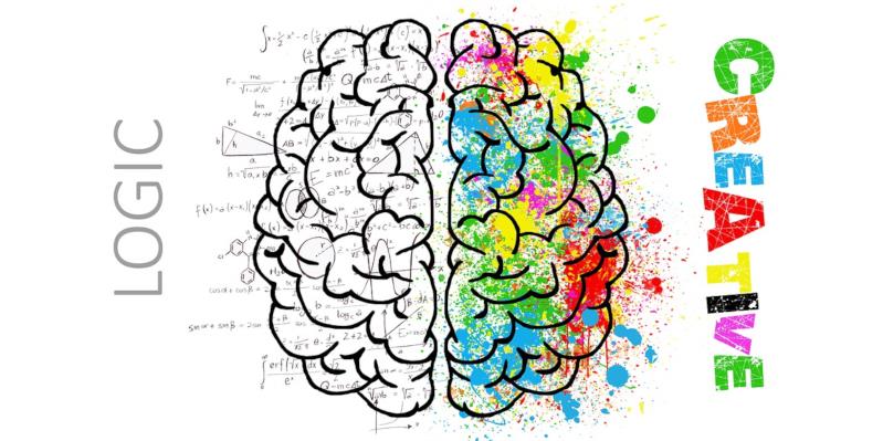
What is color psychology, anyway?
A significant area of research, color psychology looks at how colors influence and impact decision-making power and consumer behavior.
From a marketing perspective, the story that colors tell is important. Different colors impact buying decisions differently; even slight color changes to a specific product can change how much people want to buy it. Yellow, for instance, has been shown to have a positive impact and make people feel happy; it’s not surprising, then, that in the United States alone, more than 75 percent of pencils sold are yellow.
However, there are a lot of misconceptions surrounding color psychology, the biggest of which that colors alone cause conversions. This couldn’t be further from the truth. Studies have shown how personal choices, upbringing, differences in opinion and culture can all dilute the effects specific colors have on people.
So, it’s important to understand that while color psychology is useful to think about when branding, it isn’t an exact science.
Colors – An essential cue for branding
When it comes to color perception and branding, there have been a number of attempts to study how consumers behave in reaction to different colors. For example, according to the study “Impact of color on Marketing,” more than 90% of “snap judgments” about products are based on the color of the logo alone.
In this respect, the relationship between brands and their colors depends on whether the psychological meanings of the colors fit the product or services sold. The following colors are the most popular colors used in branding; let’s see how brands use them to send an emotional message to their audience.
| Purple Brands | Red Brands | Blue Brands | Yellow Brands |
| Stands for royalty, sophistication, luxury, spiritually & imagination. E.g., Asprey, London, Yahoo, etc. | One of the most motivating colors, red conveys raw and pure emotion coupled with energy. It also symbolizes passion, love, excitement, and of course, anger. E.g., Coca Cola, Target, etc. | Simple, clean, formal, and presentable, blue has stood the test of time and is still a branding favorite. E.g., Nivea, Facebook. | Playful, positive, heartwarming, and optimistic, yellow is an excellent choice for a brand looking to strike a happy chord. E.g., Snapchat, Subway, Best Buy. |
The most effective way to master color psychology in marketing is to use colors that reflect the personality you want your brand to have, and not to just choose colors you like. You’re probably not going to get many leads for your business by using yellow as your brand color if you’re selling policy bonds or insurance. On the flip side, choosing lipstick red when pitching your accounting software to your clients can be pretty unappealing.
The psychological impact of color is stronger when a company chooses a color that appeals to everyone, regardless if they’re buying a specific product or just interacting with the brand as a whole.
Just look at the home-improvement retail company, Lowe’s, which is best known as a reliable brand; they use blues that both convey this trait and are compatible with the types of products in their industry. Similarly, we have Cadbury, a brand that has a luxury quotient akin to Royal Canadian Whiskey—another brand that stands as the hallmark of royalty. Both of these brands seem to have mastered the art of color psychology effectively, using purple to create an emotional impact and connect with consumers at large.
Colors psychology for marketing – Shifting trends
It’s not unnatural for a brand to exhibit more than one characteristic trait; however, there is usually a public consensus about the main, dominating trait. This gives you some leeway when choosing your brand’s colors. While there are a handful of colors that people may associate with a specific feature, such as brown depicting sturdiness, purple for sophistication, or red for passion, these colors can also be interpreted differently depending on the context. In this vein, colors should reinforce a brand’s personality rather than define it.
For example, green won’t always symbolize calm; without context, green can represent environmental issues like it does for Greenpeace, or it can symbolize money in finance businesses like Mint. Or, take brown, which suggests ruggedness in Saddleback Leather, while giving off an invigorating feel in any chocolate commercial that you might see on TV.
There is never going to be an obvious choice when deciding on brand color, as it solely rests on the context and the persona that your brand tries to evoke. The bottom line is that there’s no cheat sheet as to how and why you would choose a particular color scheme – but that doesn’t mean every choice is the “right” one. Do your research about how people perceive colors, and you’ll be able to successfully apply color psychology to your own brand!
Posted by Ingenium Web
iNGENIUM Ltd. is an software development company from EU which delivers a full range of custom .NET, web and mobile solutions for different business to meet partner's demand.
The Power of Imagination Makes Us Infinite
Related Posts

Speed defines Solana, but speed alone does not define useful testing.

Every question below came from real users, the kind that show up in forums and support threads over and over. The answers skip the fluff. If you have wondered any of these, read on.


Struggling to get your profile noticed no matter how often you post?

Imagine craving a beef burger really badly. So, you end up searching all the nearby restaurant options. What is the one thing that helps you decide where to order from?

The growth of digital advertising has unlocked countless opportunities but also introduced significant risks for modern marketing teams.


Comments
comments powered by Disqus