Building a Killer Homepage – The Do’s and Don’ts That Can Make or Break It
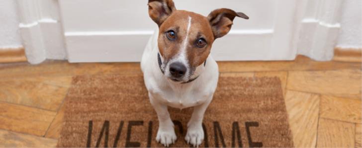
Welcoming your audience and potential clients to your website has never been so crucial in the online world. Your homepage is the perfect example of a digital welcome mat and should effectively greet visitors when they visit and entice them to want to stay.
These days, a beautifully designed website isn’t enough – it needs to be combined with a homepage that functions easily in an uninterrupted environment. People need more to keep them ‘glued’ to a good website and a platform that’s not user-friendly or armed with too many distractions will simply turn your guest away, and leave them knocking on someone else’s door instead. We take a close look at what elements are needed to create a homepage that draws in your visitors deeper, and keeps them wanting to explore.
Comfort is Key
At home, a ‘welcome mat’ should do just that – welcome your visitor. It doesn’t matter whether they are an old friend returning or a possible new acquaintance, making your guest feel comfortable from the moment they knock on your door is important.
A website is no different. The decision to stay (or go!) comes down to comfort so this should be implemented in the web design process. When your guest feels comfortable, they are happy to invest their time. If something doesn’t feel right, a tinge of discomfort can creep in and just like that – they flee, probably never to return.
Levels of comfort vary from person to person so determining what works and what doesn’t can be tricky, but the basics will still remain the same. People want to know they have come to the right place, so clear headlines and information is vital in the first few seconds of landing on the homepage.
Do: Introduce your guest with user friendly, clear navigation and remember their attention span will be short, so save the fluff and get to the point.
Don’t: Make them feel like there is just a robot on the other end of the page. People want to communicate with someone real so personalising the site with a short introduction can help visitors identify with the person behind the scenes.
Layout and Making Proper Use of White Space
The layout of your homepage should be clutter-free and clean – if there is too much happening on it, visitors can feel overwhelmed. A clean and well planned homepage will give off a professional and organised appeal.
Minimalism transfers perfectly into website design so be sure you’re making use of white space. Open airy spacing is utilised in designs effectively and can help to make your overall message ‘pop’ and stand out clearer.
Do: Strive for simplicity and create a layout that is clean with proper use of headings to break up any text. The most important parts of your homepage, images and content should be kept at top where viewer’s eyes will find them first. If content is below the fold, make sure the top of the page is interesting enough to make the user want to scroll down for more.
Don’t: Clutter your homepage with too many images, banners and never-ending text. In the busy world we live in, no one has time to ‘sift through’ the messiness to find what it is they are after.
Colour Choice and Background
Effective colour palettes and background set the tone for your homepage so should reflect your brand, services and message. Consider how ‘loud’ you want your colour scheme to be and how these can either draw in, or scare off visitors. What ambiance do you want to put out, a cool calm and collective one or a brighter more vibrant colour scheme? If you have developed promotional material already for your business, staying consistent with these colours will help people identify with your brand quicker.
Do: Match your colour scheme with your background. They should go hand-in-hand together, compliment the rest of the website design and reinforce your brand.
Don’t: Use a background that takes the focus from everything else. Content and images still need to stand out and not clash with your colour scheme. Adding too many colours can cause a chaos feel.
Images and Text
A picture is worth a thousand words but even still, backing images up with text ensure everyone understands the message you are trying to convey. Some visitors will identify quicker through pictures, whilst others will want other content to read.
Concise, targeted content is the backbone of an effective website. Because most users don’t read a webpage like they do with a magazine or book, it’s important the text is simplified. Users will tend to scan so you want the information that is vital to not get lost in pages of content. Use fixed points to guide users through the homepage and stay away from repetition. Your homepage should have the basic, most crucial points on it and then this content can be fleshed out on other pages.
Do: Use a variety of content and keep it fresh and interesting. Content can be in the form of text, images, video, infographics and more so keep it exciting by using all these sources.
Don’t: Try to cram all the information onto the homepage – this will just over do it. No one has the time to read your website over the next few hours so keep their attention by sticking to the most relevant information.
Buttons
Some homepages need buttons, other work fine without but if you make the decision to use them – use them right. Buttons can be for a navigation purpose, call to action or linked to other websites and social media plugins. If you want the user to click on it, it needs to be made interesting and tempting enough for them to do so.
Do: Keep the wording as short as possible. A good rule of thumb is 4 words and under for a call to action.
Don’t: Let your buttons go unseen. Placement is your first priority with buttons – you don’t want them to get lost in other information and you don’t want to just scatter social media plugins wherever. Work buttons into the layout of the page so it’s consistent and well thought out.
Navigation – Where’s Wally?
The best homepages will work at keeping its visitor on the site for longer than 4 seconds. You want them to find the information they are looking for straight away, without having to jump through hoops be pressured with sales calls or turn into a game of ‘Where’s Wally’.
Do: Keep it simple silly (The KISS principle). If the content isn’t mapped out clearly for the user, they are just going to find what they want elsewhere.
Don’t: Hide or blend information, keep content upfront. Be careful with flash sites and stay away from them where possible – they tend to burry information under heavy graphics and animation.
Related Posts
A web app development has been ruling the world for a very long time. Customers are eager to invest in web app development as Paws has made things easier for the users.
As the world of eCommerce continues to evolve, businesses are constantly seeking ways to stand out in the digital landscape. According to a report by Statista, it is predicted that global online sales will reach an impressive mark of $6.5 billion by 2023.
For startups in 2024, there are few aspects as important as web development.
In today's digital era, tech startups dot the horizon of innovation, each one vying for the attention of investors, clients, and the market at large.
Free webinars can be one of the most effective ways to market your brand or product.


Comments
comments powered by Disqus