
The Best Google Web Fonts

For the Longest time the web was lacking when it came to the selection of fonts that could be used safely on the web. When I say safely I mean that you could use only the fonts that someone had installed on their computer on your website. This was a problem that went unsolved for many years and many designers learned to deal with it but were always left wanting.
The days of having to use standard fonts like Times New Roman, Helvetica, and Arial or sacrificing accessibility and load times for graphic text with special fonts are nearing their end due to new advances in web technology.
We already have written about list of the best safe fonts, but what about non-standard browser web fonts. Which ones are the best and How to integrate them with you website.
One of the easiest is to use Google Web Fonts - open-source fonts optimized for the web. Google Fonts library has over 600 font families, and many of them are of sufficient quality to use in professional designs.
We are absolutely sure that you are are find fonts that are perfect match for your site design.
Using Google Fonts
Here is a quick tutorial How to use Google Fonts. If you are already familiar with using Google Fonts, please skip this section.
Visit Google's web font home page and look around and use the search and filter functions in the left hand column to find a font you would like to use in your site.
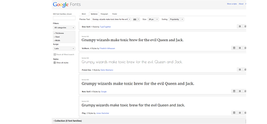
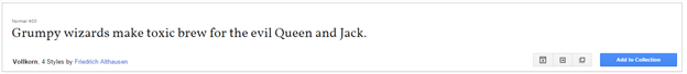
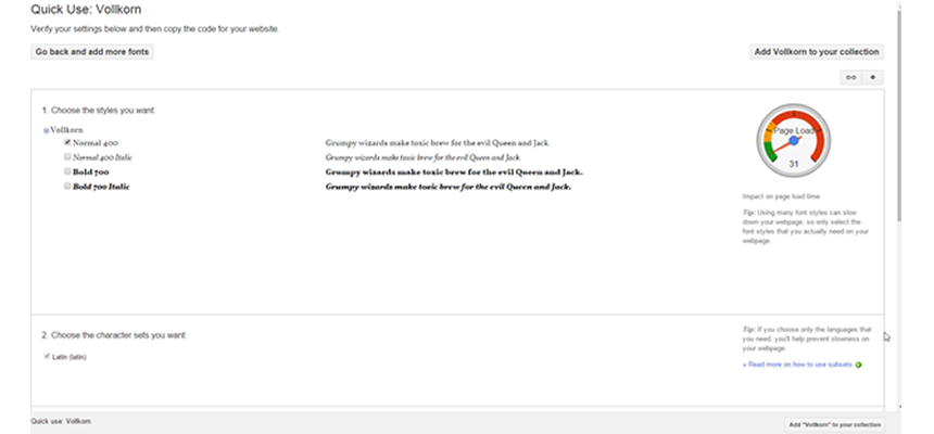
Once you have found the perfect font, select the Quick use button below the font. This will take you to a page where you can select the styles you need, and grab the HTML and CSS code that you'll need in your theme to utilize the fonts in your store.
Add your font styles, but be aware of the page load indicator in the right column when selecting your styles. Too many styles will make your page load slower for shoppers.
When you are done selecting your styles, scroll down to 3. Add this code to your website section and select and then copy the provided code.
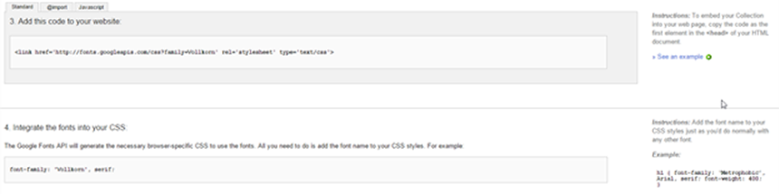
Afterwards open your site in code editor and look for the closing tag. Paste the code you copied just above the closing tag and save your changes.
Also don’t forget to make necessary style changes as well.
Using Multiple Google Web Fonts
Use the same steps as above to use multiple fonts, but click the Add to collection button for all the fonts you wish to use (remember that using too many can be a drain on your sites resources). When ready, click the Use button at the very bottom of the window and follow the steps above, creating a new font set in Frereway for each font you selected.
The Best Google Web Fonts
These are the 10 best Google web fonts that we like to use in our projects. At bottom of each font we will add font link and css example of font usage.
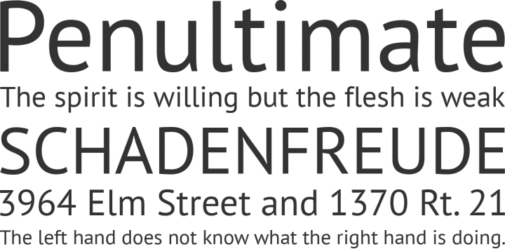
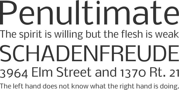
Open Sans
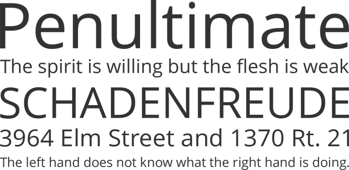
Open Sans was designed by Steve Matteson and comes in 10 different styles, from light to extra bold. The font itself is very simple, professional, and clean, yet it’s very exciting. Open Sans was designed with an upright stress, open forms and a neutral, yet friendly appearance. It was optimized for print, web, and mobile interfaces, and has excellent legibility characteristics in its letterforms. It looks beautiful in small and larger sizes, but the extra bold variation is pure perfection.
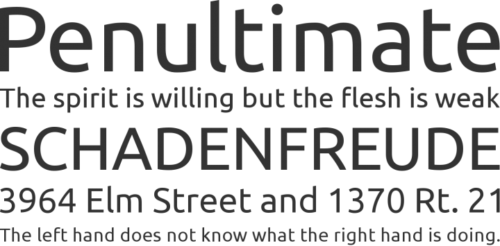
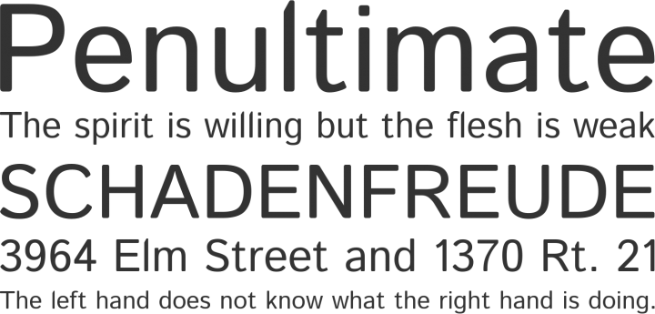
Raleway
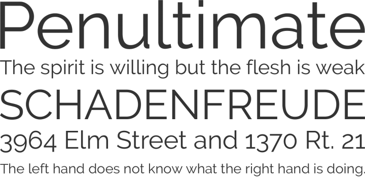
Raleway is an elegant sans-serif typeface family designed by Matt McInerney. It is a display face and the download features both old style and lining numerals, standard and discretionary ligatures, a pretty complete set of diacritics, as well as a stylistic alternate inspired by more geometric sans-serif typefaces than its neo-grotesque inspired default character set. It also has a sister family, Raleway Dots.
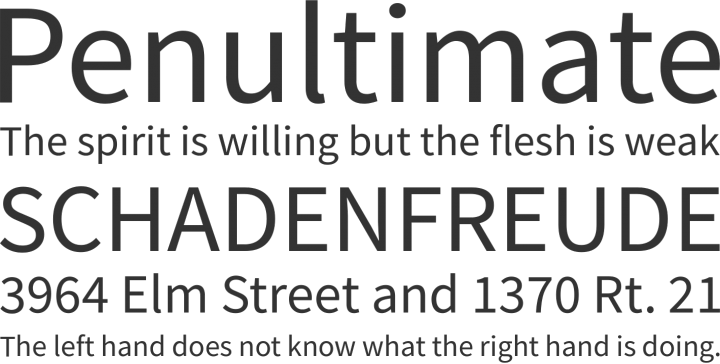
Lato
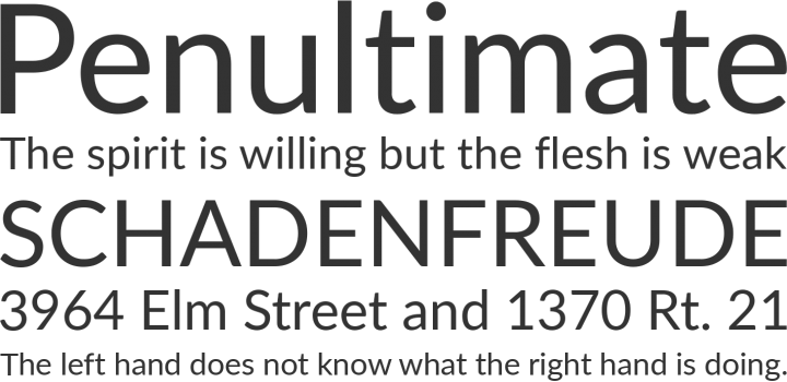
Lato is perhaps the most unique and interesting sans-serif font on this list. It was designed by Łukasz Dziedzic and includes 10 styles. It goes from thin all the way to ultra-bold. The letters in Lato have some unique curves which can only be seen in larger sizes. The semi-rounded details of the letters give Lato a feeling of warmth, while the strong structure provides stability and seriousness.
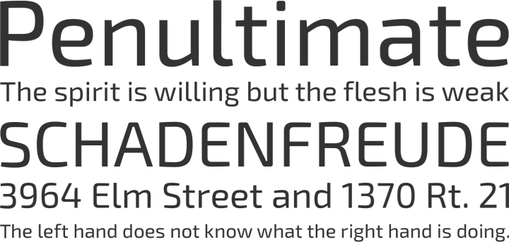
Roboto
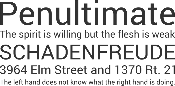
Roboto was designed by Christian Robertson and is the official font family of the Android operating system. Roboto comes in 12 styles with weights ranging from thin to ultra-bold. The font is very modern and essentially combines the best aspects of classic fonts such as Helvetica, Arial, and Univers. Regular Roboto font feels slightly condensed so it allows more characters per line. There are two other excellent variations of Roboto, including Roboto Condensed which has 6 styles and Roboto Slab with 4 styles.
PT Sans
PT Sans was designed by ParaType and it comes in 4 styles, normal and bold and italic versions of each. Although it seems like 4 styles are just not enough, they are perfectly fine for most people. Of course, if you’re a designer, you’ll cringe at the thought of only 4 styles and just 2 weights. Helvetica Neue has made us a bit spoiled in that regard. PT Sans has some funky characteristics such as the capital Q’s tail, which sits outside the letter and it makes the letter look more dynamic.
Ubuntu
Designed by Dalton Maag for use in the Ubuntu operating system, Ubuntu is a humanist-style font that’s popular for being very rounded and quirky. The curves in most characters meet the stem directly at the end so there’s no sign of any serif or ear. Ubuntu has 8 styles with weights from light to bold. If you’re looking for a condensed or monospaced font, there is also Ubuntu Condensed and Ubuntu Mono.
Source Sans Pro
Designed by Paul D. Hunt, Source Sans Pro is the ultimate corporate-style sans-serif web font. It comes in a whopping 12 different styles with weights from extra-light all the way to ultra-bold. The font itself is not the most exciting one on this list, but it is probably the most professional. It works in pretty much every situation and it keeps legibility with every size.
Exo
Exo is a contemporary geometric font family designed by Natanael Gama. It was initially funded through a kickstarter project, and shortly afterwards released for free to the world. Exo has 18 styles, so you shouldn’t run into issues with not having the perfect weight. The only issue with Exo is that it tends to be a little hard to read when small, and that’s partially because it has many curves and shapes in its letterforms.
Nobile
Nobile is another font that comes in only 2 weights and 4 styles, but it is in this list because it is a spectacular font. It was designed by Vernon Adams and has a pretty tall x-height so it reads incredibly well at small sizes.
Istok Web
Istok Web was designed by Andrey V. Panov and includes only normal, bold, and italic version of each weight. So if you’re looking for many different weights, this font is not for you, however, if you’re looking for a less serious, yet professional typeface, then I’d recommend trying Istok Web. This font looks great large or small and keeps legibility well.
Conclusion
Using a non-standard font that the user needs to download is going to add a small amount of time to your page load – that’s inevitable. However, a typical web font from Google is about 100KB – for comparison, this is about the size of a good quality medium-sized jpeg image. Like images, the web font will be cached in the user’s browser, so only the initial page load will be slightly delayed. If you like this article, you'll love this one.
Posted by Michael Johnson

Related Posts

You have likely heard about the potential of Al to revolutionize stock trading, but how can you actually leverage this emerging technology in your own portfolio? In this comprehensive guide, you will walk through the step-by-step process to implement Artificial lntelligence for algorithmic trading.

To succeed, digital marketing teams must increasingly concentrate on and learn about optimizing marketing processes.

In almost all forms of modern business, marketing is an essential function.

As the world of eCommerce continues to evolve, businesses are constantly seeking ways to stand out in the digital landscape. According to a report by Statista, it is predicted that global online sales will reach an impressive mark of $6.5 billion by 2023.

In the era of high-speed internet, owning a server with a 10Gbps connection offers an unparalleled advantage in terms of data transfer speed, website performance, and user experience.

To make your business successful in the modern age, you need to excel at digital marketing and have a strategy that can allow you to beat out the competition.


Comments
comments powered by Disqus