
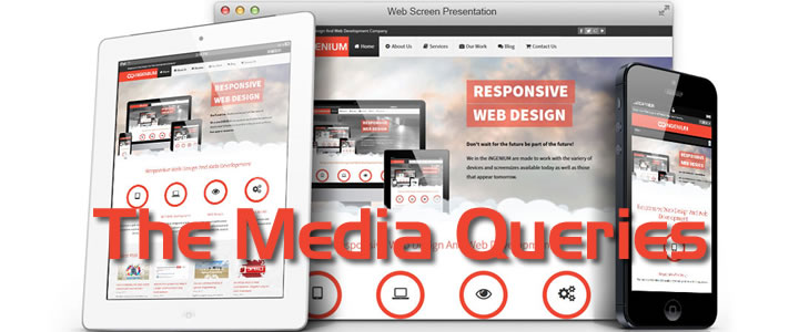
Responsive Web Design: Media Queries
The core of any Responsive Web Design framework is the media query. Media queries are what enable your website to call different style declarations from your stylesheets based on the current window width of the viewing device.
A media query is a CSS declaration that is used as a parameter for when to call other style declarations based on the dimensions of the current viewing device.
A mobile device in portrait orientation with a viewport width of 320px can be detected and given different styles compared to a desktop device with a viewport width of 1024px. Conventionally, the different styling would normally be restricted to layout, backgrounds, and images; in essence, a completely new set of styles can be delivered.
With the CSS3 media query module, we are able to target particular CSS styles at particular device capabilities, such as the viewport width.
There are two ways to call a media query: using an external stylesheet, or writing directly inside a stylesheet.
External Call
<link rel="stylesheet" media="screen and (min-width:320px) and (max-width:480px)" href="css/mobile.css" />
CSS Direct Call
@media screen and (min-device-width:320px) and (max-device-width:480px){
/*Style Declarations For This Width Range */

    aside{display:none;}

}
What’s Being Called Here
The two code snippets above are both examples of two different ways to make CSS declarations that only are to be called when the viewing device is between 320px and 480px. A good idea of use for either one of these declaration parameters is for calling styles for mobile that would break outside of this range. For instance loading certain styles for devices similar in width to iPhones, but making them to be ignored by certain Blackberry devices. Since we already have a general understanding of what media query is, let’s now proceed to breaking it down. For the remainder of this article, we will only be referring to the media query call used directly inside the CSS file.
@media screen
For those unfamiliar with the media attribute, it is used to separate what styles are called for different media types. Commonly used types are print, speech, projection, braille, screen and all. Despite the usefulness of each media type, for RWD our focus shall be geared toward the screen type.
By definition the screen value is intended primarily for color computer screens, and is the default value for CSS. This call to media type is how you start the query and later call on your parameters.
Examples:
A call to set the body background to red for computer screens
@media screen{

     body{background: #ff0000;}

 }
A call to set the body background to white for print
@media print{

     body{background: #fff;}

}
The Width Parameters
Now its time to take a look at what makes our websites responsive, the width parameters. If you’ve been following along you’ll realize that @media screen is what starts our query, and the min and max width attributes set the parameters. So with this in mind, you know how to call different style declarations for different viewing widths. Like in our example from earlier, we set the min and max width to 320px and 480px respectively. This means that anytime the viewing device is at a width between these two parameters the declarations set in the query are called.
Difference between device-width and width
Sometimes you’ll see developers making calls to device-width or width. The difference between these two here is that device width is going by the set width of your device, with any zoom type changes being ignored.
@media screen and (min-device-width:320px) and (max-device-width:480px){

     /*Style Declarations For This Width Range */

     aside{display:none;}

}
What can media queries test for?
When we building responsive designs, the media queries that get used most often relate to a device's viewport width (width) and the width of the device's screen (device-width). However, just in case the need arises, here is a list of all capabilities that media queries can test for. Hopefully, some will pique your interest:
- width: The viewport width.
- height: The viewport height.
- device-width: The rendering surface's width (for our purposes, this is typically the screen width of a device).
- device-height: The rendering surface's height (for our purposes, this is typically the screen height of a device).
- orientation: accepts either portrait or landscape
- aspect-ratio: such as 16:9, or 4:3
- resolution: the Dots Per Inch (DPI), or Dots Per Centimetre (DPCM)
- scan: a display type that targets televisions that use progressive scanning
- grid: matches Teletype displays or devices that only show a single fixed font
- monochrome: checks the number of bits per pixel in a monochrome frame buffer, with 0 being falsey
- color: checks the number of bits per color of the device, with 0 being falsey
- color-index: checks the number of entries in the color lookup table of the device, with 0 being falsey
The best way to load media queries
Although modern browsers are smart enough to ignore media query targeted files that are not intended for them, it doesn't always stop them actually downloading the files. There is therefore little advantage in separating different media query styles into separate files. Using separate files increases the number of HTTP requests needed to render a page, which in turn makes the page slower to load.
Resources
Responsive Web Design by Ethan Marcotte
Breaking Down Media Queries for Responsive Web Design
Jump Start Responsive Web Design by Craig Sharkie & Andrew Fisher
Responsive Web Design by Ethan Marcotte
Responsive Web Design with HTML5 and CSS3 by Ben Frain
Posted by Ingenium Web

iNGENIUM Ltd. is an software development company from EU which delivers a full range of custom .NET, web and mobile solutions for different business to meet partner's demand.
The Power of Imagination Makes Us Infinite
Related Posts

Today's internet era is more about having a mobile-friendly website that is easy to access and control.

The number of mobile users has been growing continuously.

Need a good reach? Go mobile. Want to improve your brand’s visibility? Get onto the mobile. Want to enhance your user base? Create a mobile app.
When mobile internet usage surpassed that from desktop devices, it didn’t come as a blow to those who were paying attention.


Comments
comments powered by Disqus